Skip to content
TAIO Studio
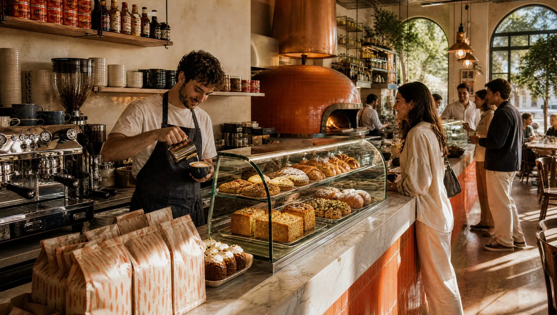
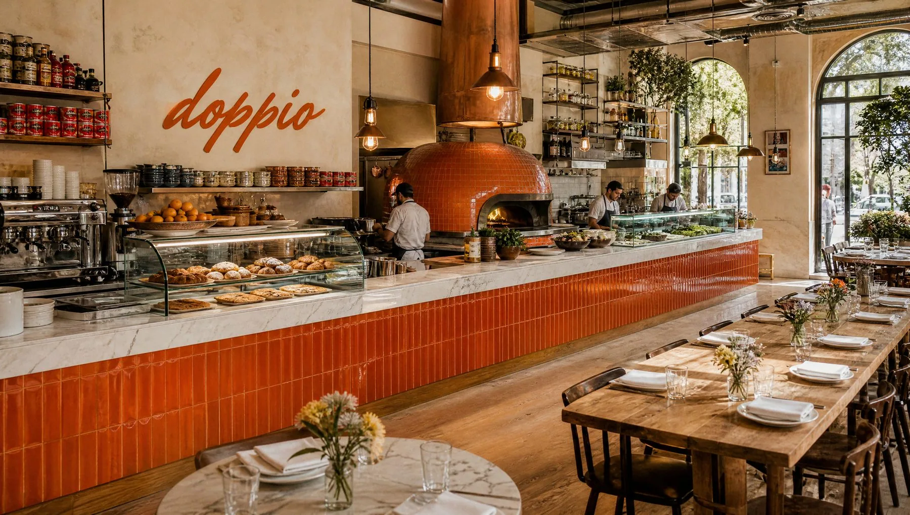
The DOPPIO open kitchen: one orange-tiled counter with the coffee station, the wood-fired oven and the salad station
Pizzeria & café · branding and website

DOPPIO, twice the reason to come back.

A place that lives two lives — fine coffee and warm cornetti in the morning, Roman and Neapolitan pizza, fresh pasta and cocktails at night. I built one brand that holds both: cozy and family, but young and bold.

Year
2026
Role
Branding, web UX/UI, art direction
Deliverables
Logo, pattern, EN/HE website, 3 menus, packaging, uniform, social, OOH
Tools
[Figma, Illustrator, Photoshop]

Written in one stroke.

A single brush script, written the way a chef signs the chalkboard. The double pp is the name itself — doppio means double — and the whole word leans up at four degrees, like a peel sliding into the oven.
01 · Construction
DOPPIO logo
−4° baseline pp · the double
02 · Clear space
DOPPIO logo
dd
Keep the height of the “d” free on every side — the brush needs room to breathe.
03 · Minimum size & symbol
DOPPIO logoLogo · 90 px / 25 mm
The “d” · avatars & seals
04 · Colour versions
Primary · Brace on Farina
DOPPIO logo
Farina on Brace
DOPPIO logo
Evenings · on Carbone
DOPPIO logo
Families · on Basilico
DOPPIO logo
✕ Don’t straighten the −4° baseline
✕ Don’t set “doppio” in capitals or another script
✕ Don’t outline, shadow or stretch the stroke
✕ Don’t place it on busy photos without a band

Bold type, one brush word.

Headlines · EN & עב Aa אב
Rubik Black
One sans for both scripts — no serif, so Hebrew and English look like one family
Body, menus & UI Aa אב
Poppins + Heebo
Round and friendly, easy to read on a menu at night
The brush accent · EN & עב
buonasera ערב טוב
Mr Dafoe + גברת לוין
Two brush hands, one gesture — Mr Dafoe for the Italian word, Gveret Levin for Hebrew. One accent word per layout.
The oven fire
Brace
#D6461F
Flour & mornings
Farina
#F4EDE1
The crust
Crosta
#C8894A
Families & workshops
Basilico
#3E5B3A
Evenings
Carbone
#1E1B18
The pattern

A pattern you can carry home.

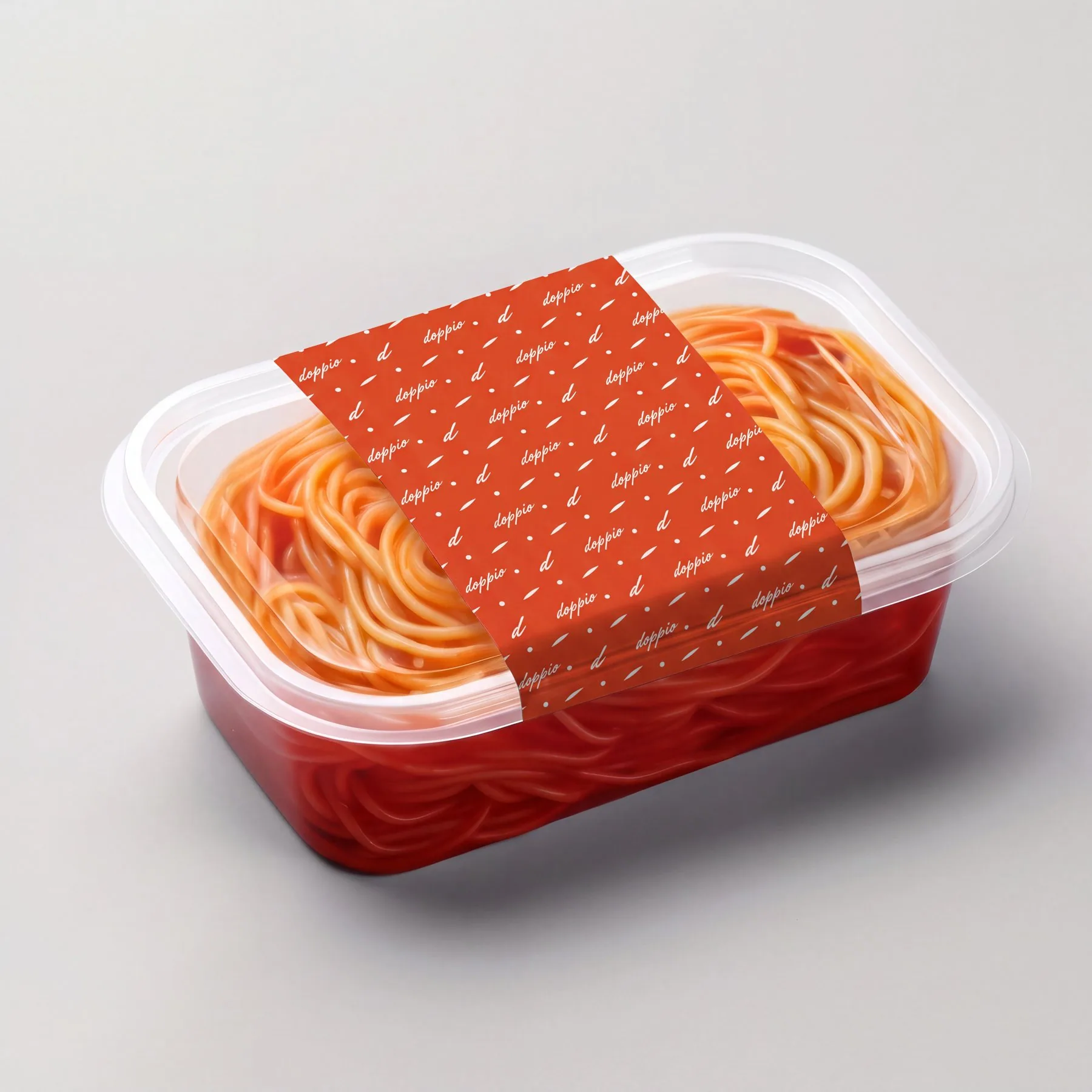
The wordmark, the “d”, a basil leaf and a dot of flour, scattered at the same −4° angle. It wraps every bag, box, sleeve and cup — so the brand leaves the restaurant with the food.

To go, all in brush.

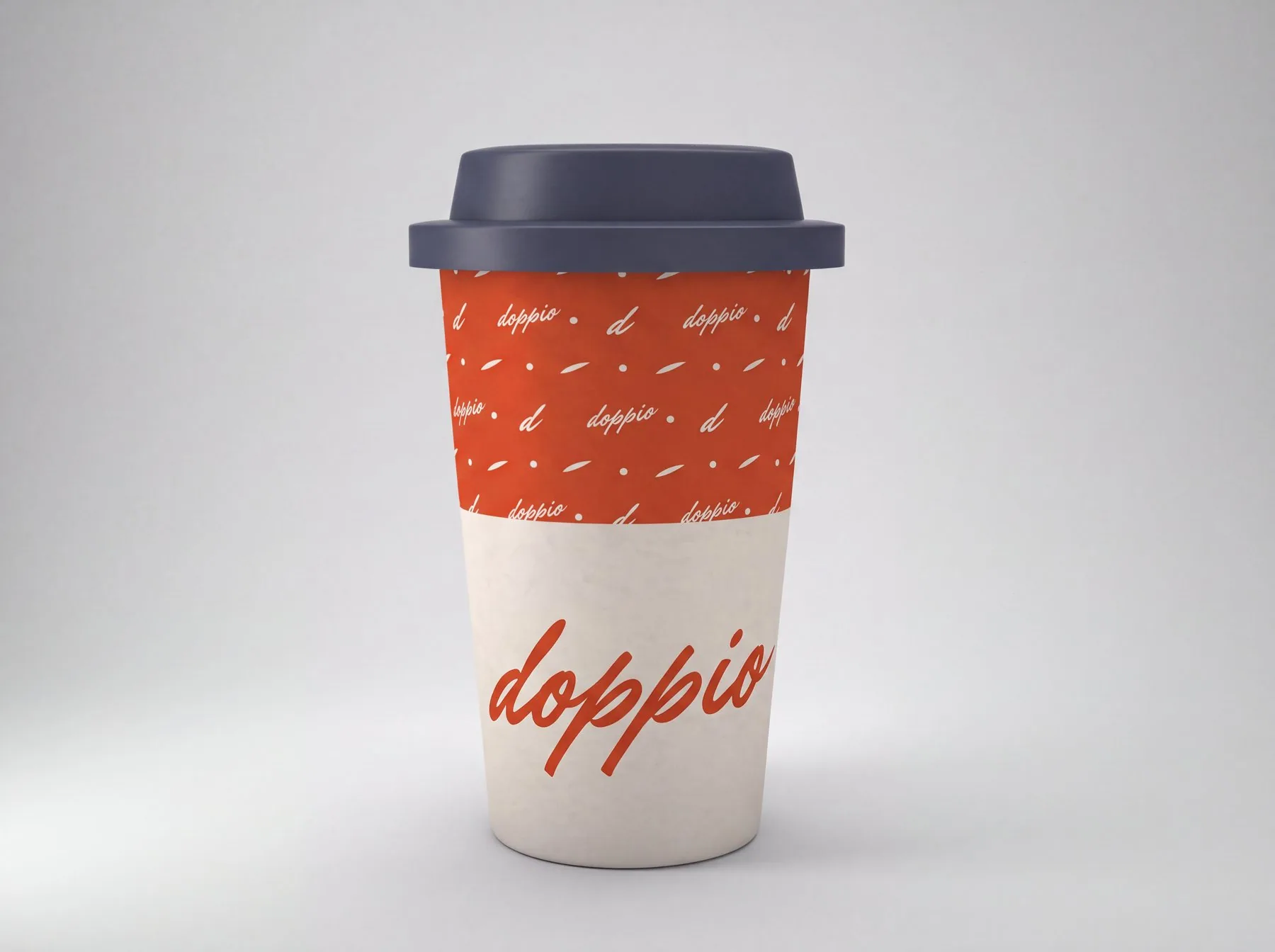
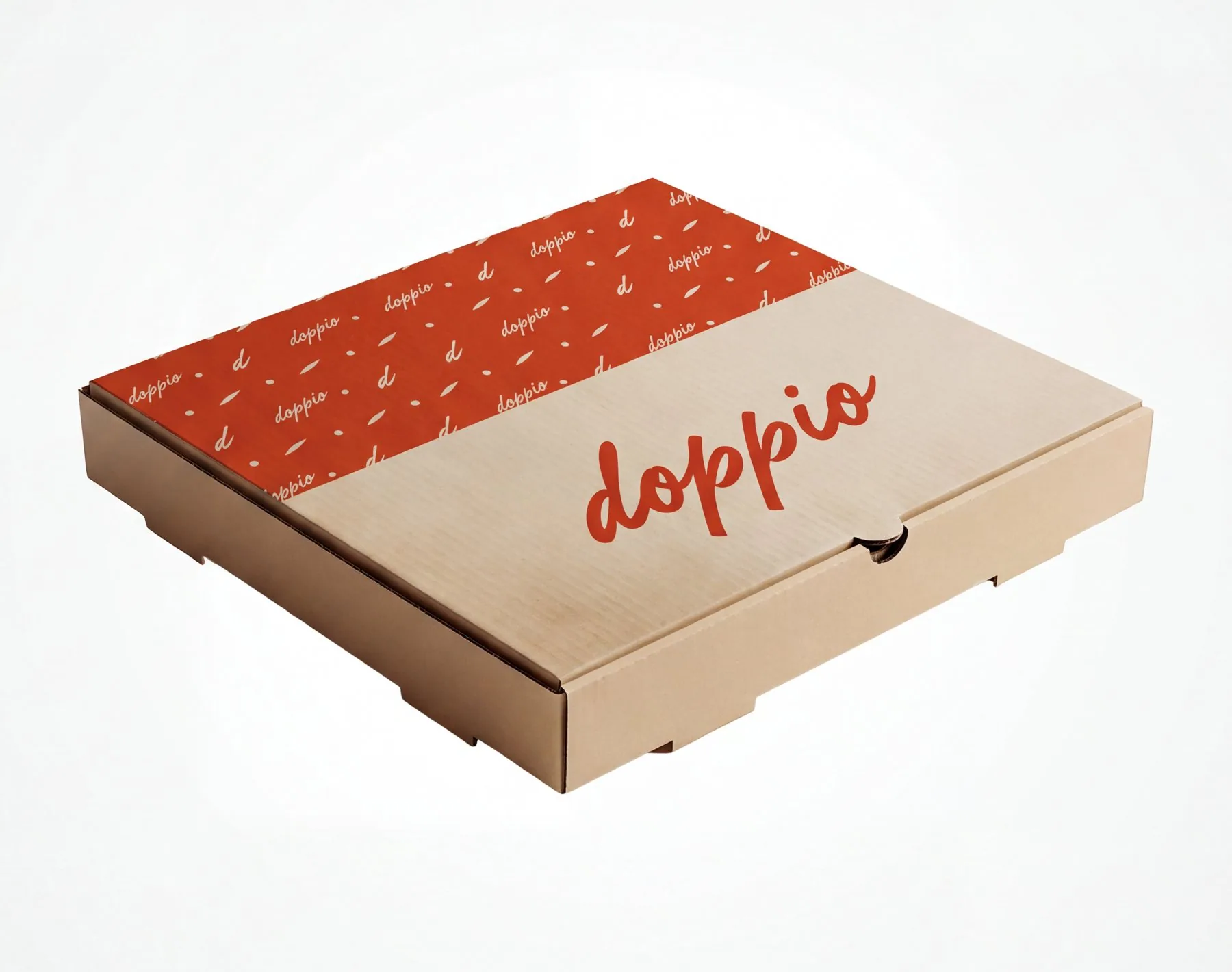
Kraft for the base, Brace for the band, the logo where the hand holds it. One rule across bag, pizza box, pasta tray and cup.
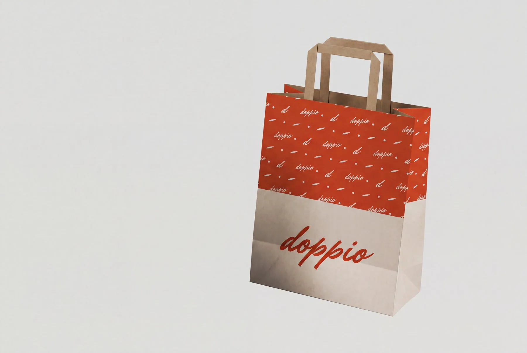
Take-away paper bag: brush pattern on top, the logo on kraft below
Kraft pizza box with a Brace pattern band and the logo
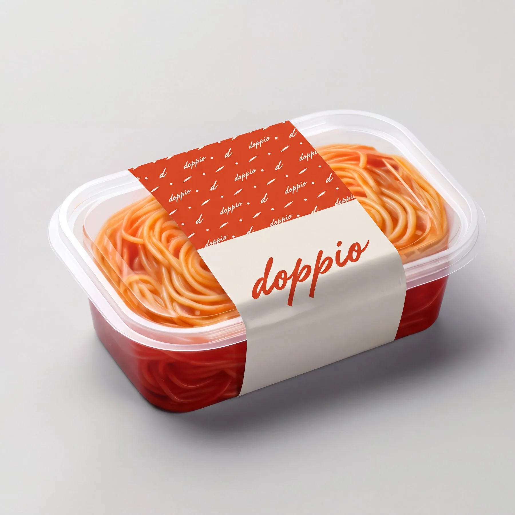
Fresh pasta to go, sleeved in the pattern and the logo
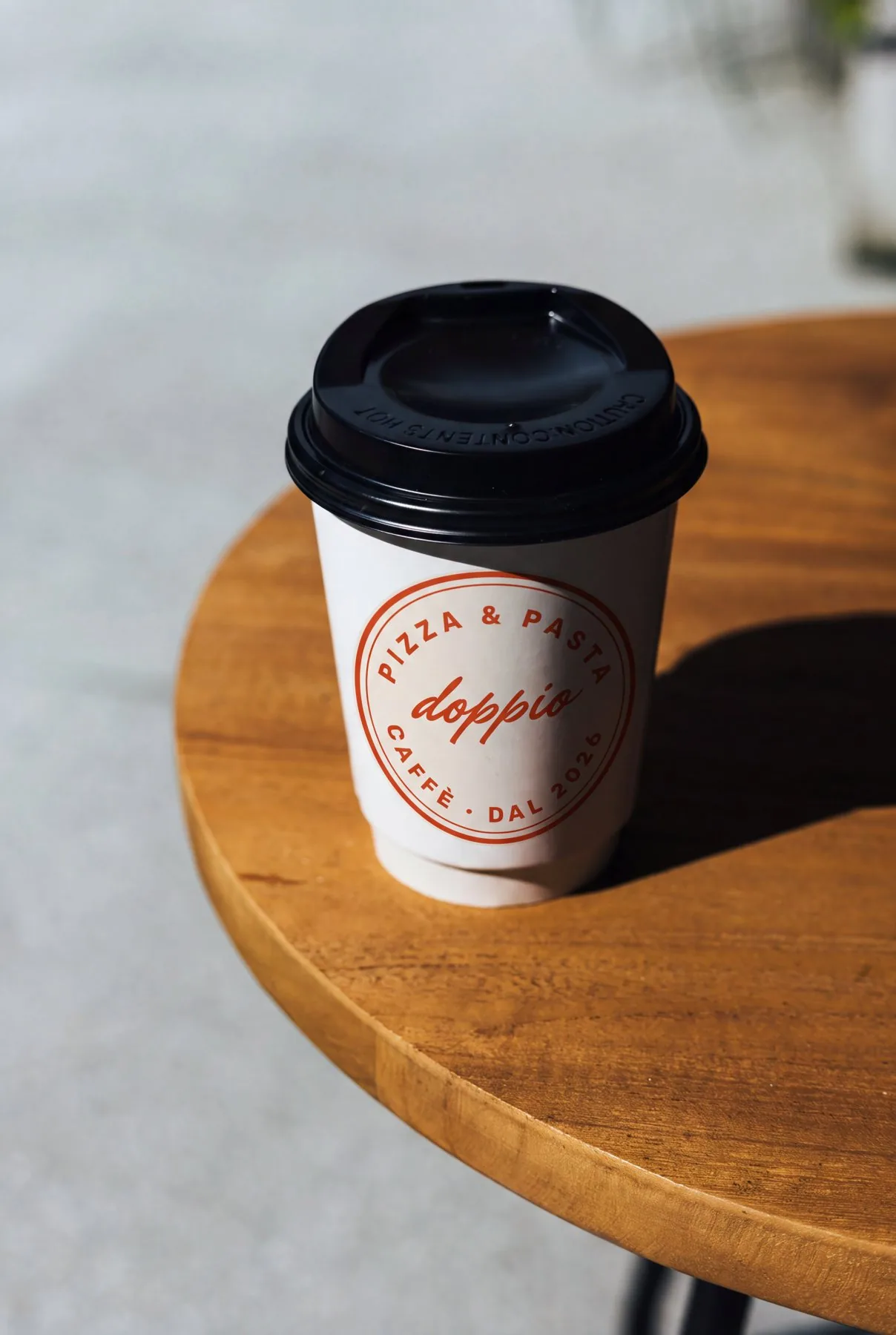
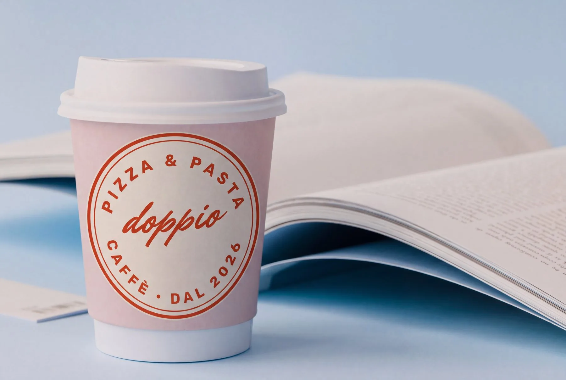
Coffee cup with the round seal on a café table
Pasta tray with a full pattern sleeve
Double-wall cup: pattern band and the brush logo
Take-away cup with the Pizza & pasta · Caffè seal

One counter, three stations.

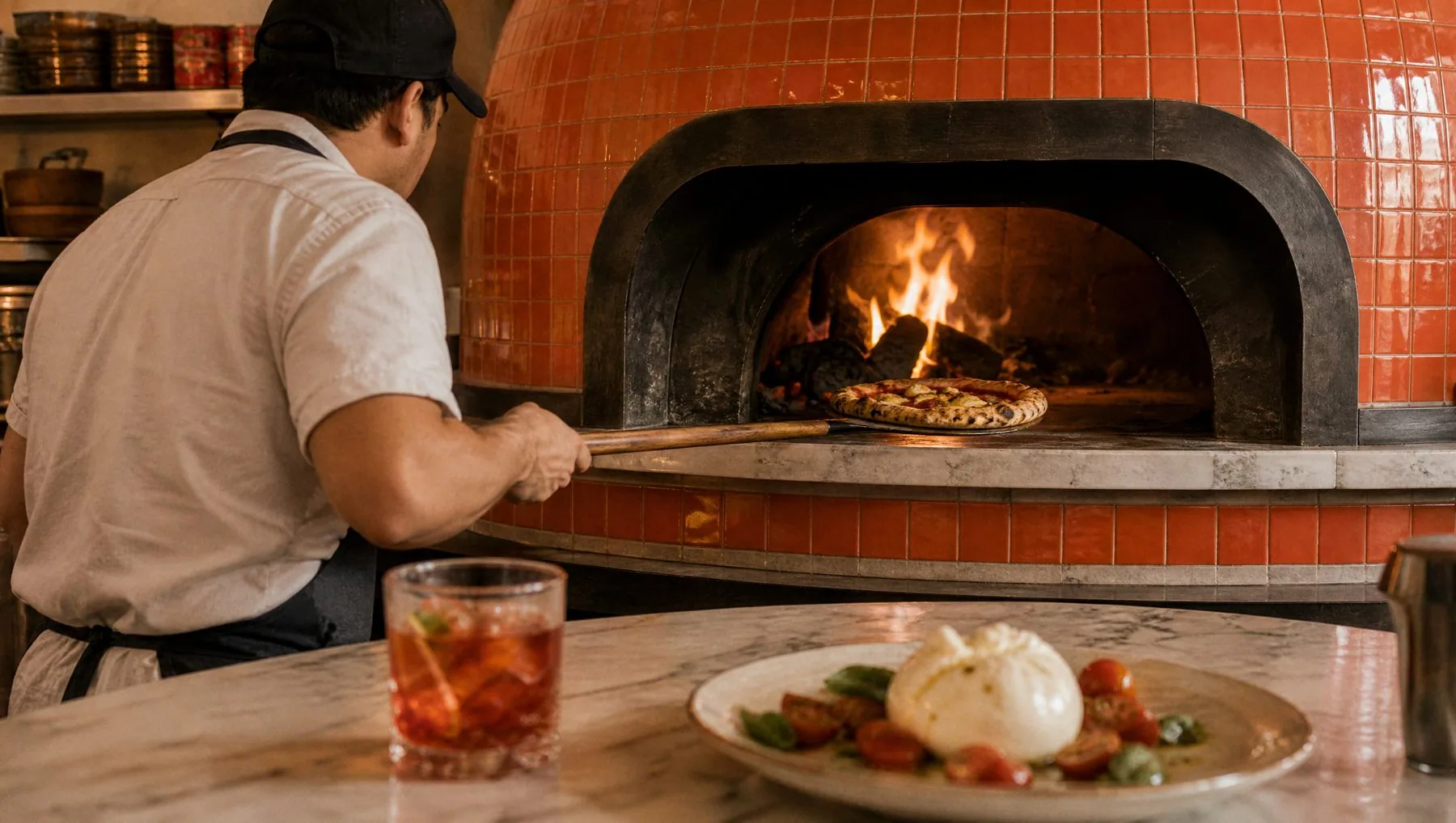
I art-directed the space as part of the brand: an open kitchen with one long counter in glazed Brace tiles — coffee and pastries at the door, the wood-fired oven in the middle, fresh salads at the end. No bar stools; every table faces the show.
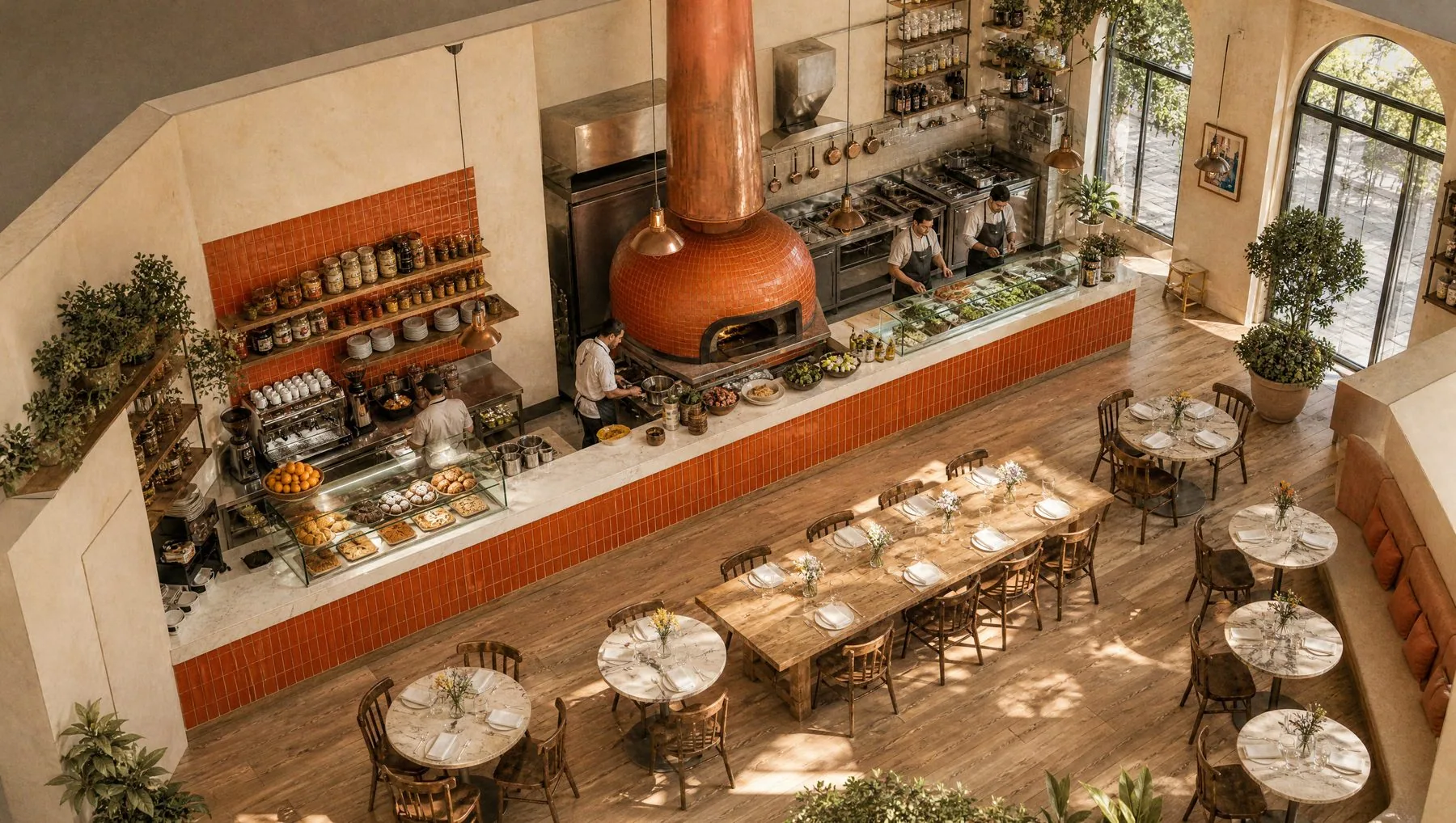
Bird’s-eye view of the dining room facing the open kitchen
The pizzaiolo at the tiled wood-fired oven
Morning at the coffee and pastry station
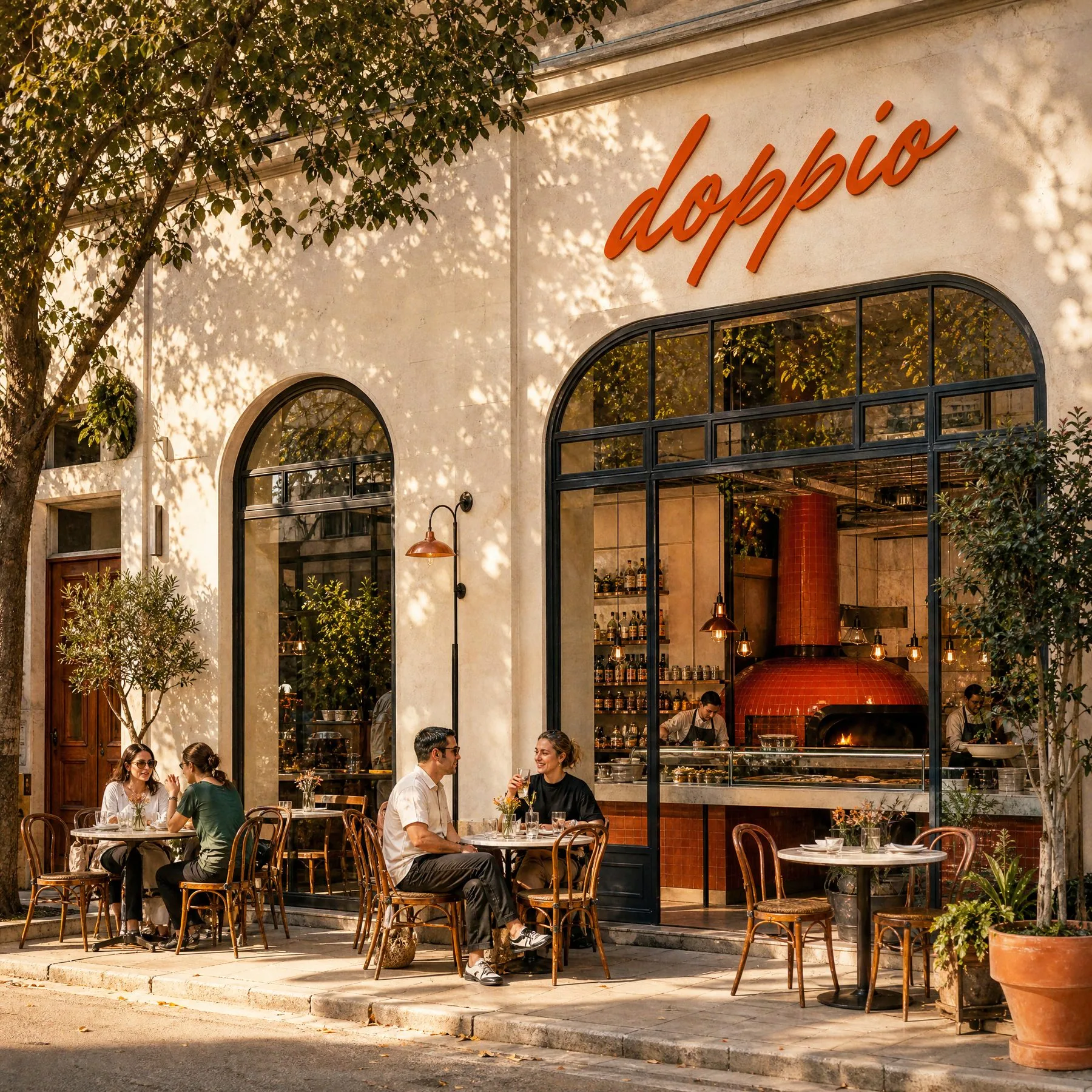
The storefront: brush logo above arched windows, café tables outside
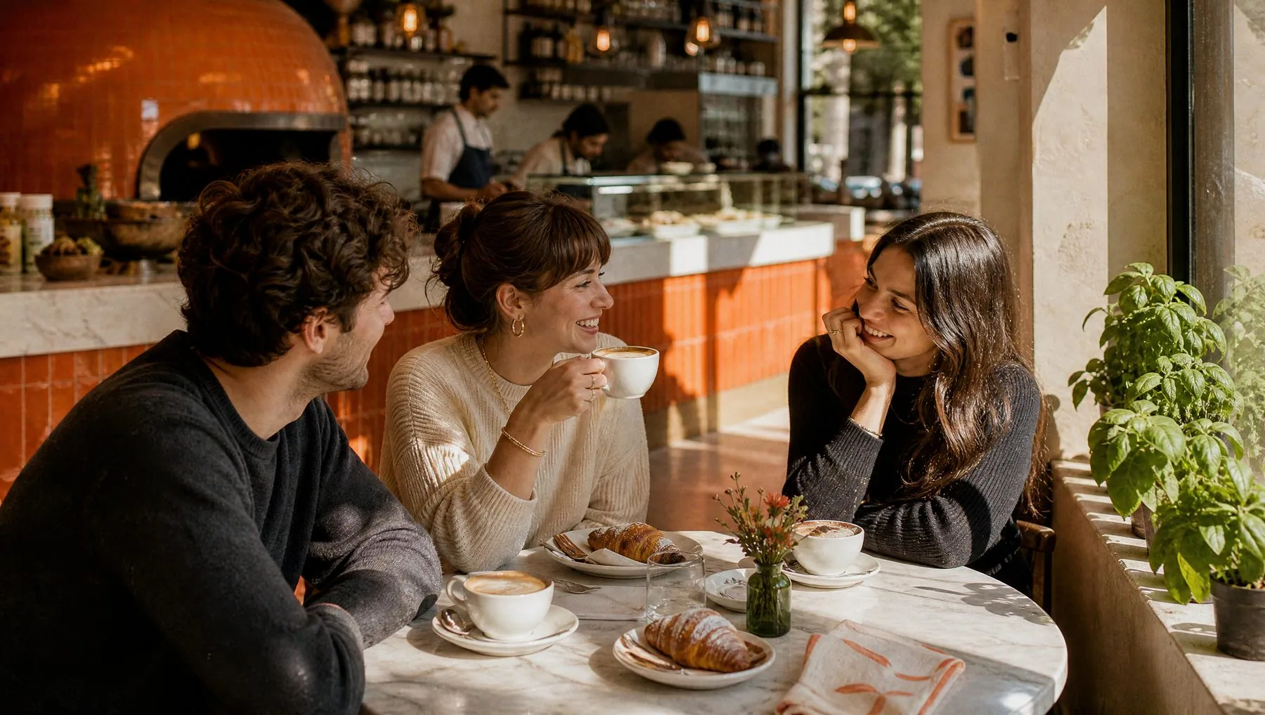
Friends over cappuccino and cornetti in the morningmattina
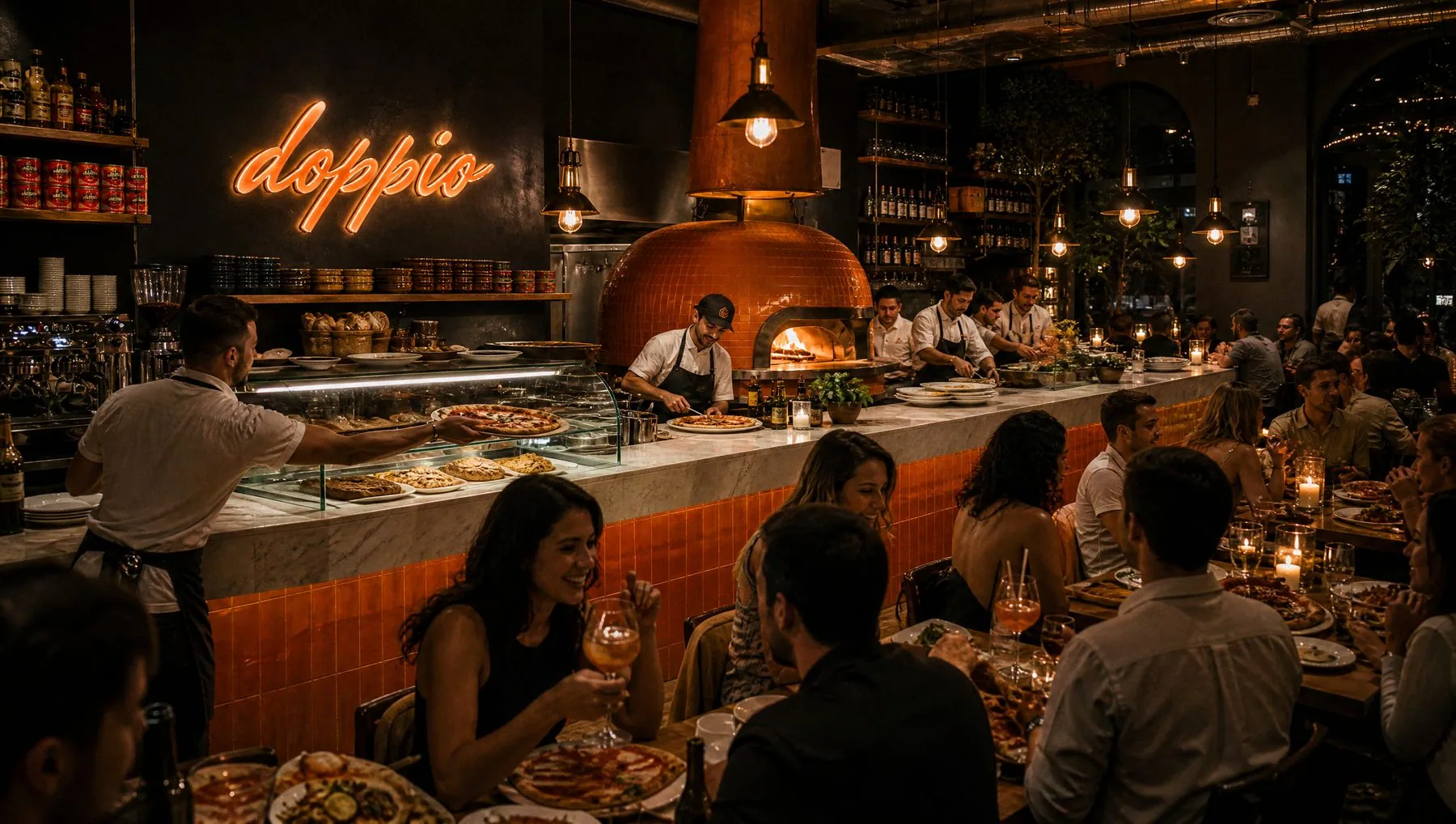
The restaurant at night with the neon logo above the ovensera

One site, two moods.

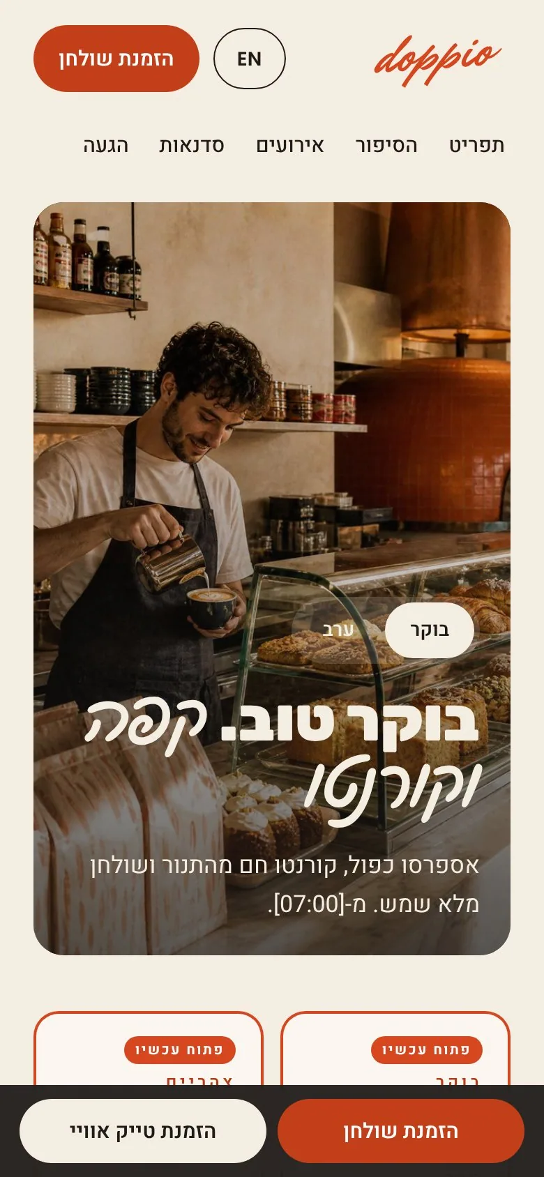
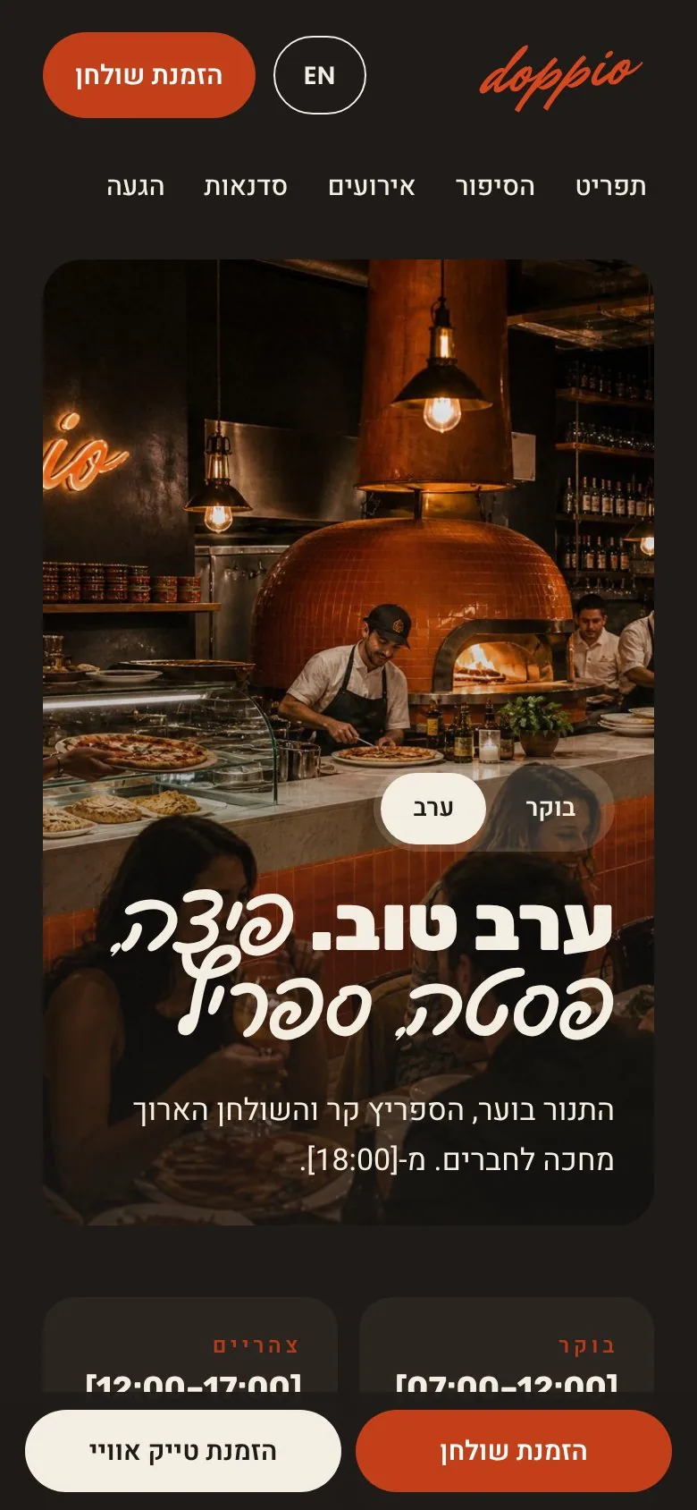
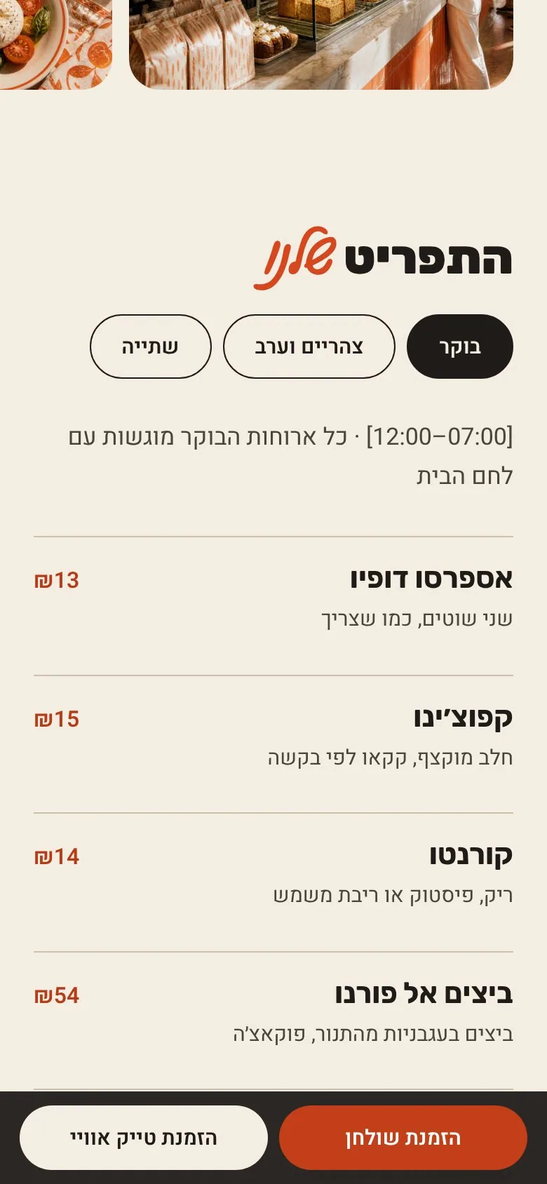
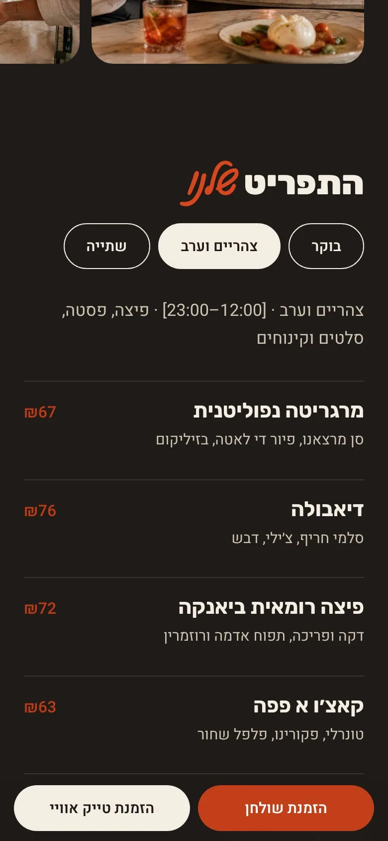
A Mattina / Sera switch changes the whole site the way the place changes at 17:00 — the photo crossfades, Farina turns to Carbone, the menu opens on what you can order now. Bilingual from one build: English and Hebrew, left-to-right and right-to-left.
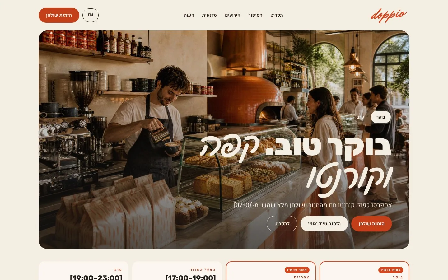
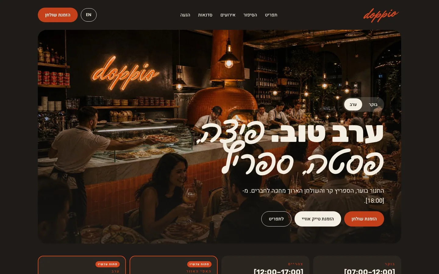
Website in morning mode, Hebrew
Website in evening mode, Hebrew
Mobile home in the morning
01 · Mattina
Mobile home at night
02 · Sera
Breakfast menu on mobile
03 · Menu, morning
Dinner menu on mobile
04 · Menu, evening
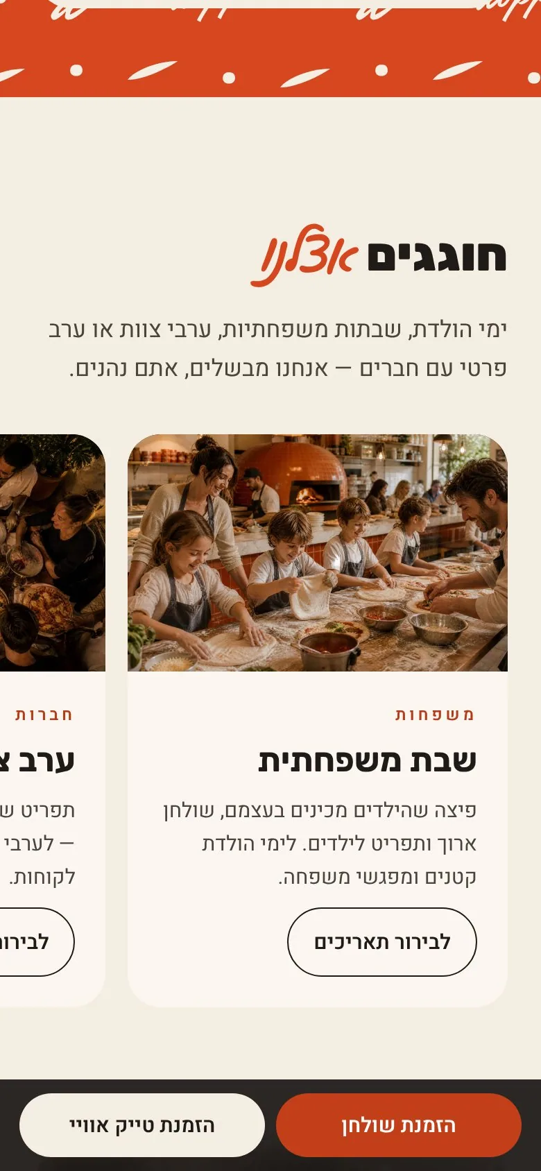
Events carousel on mobile
05 · Events
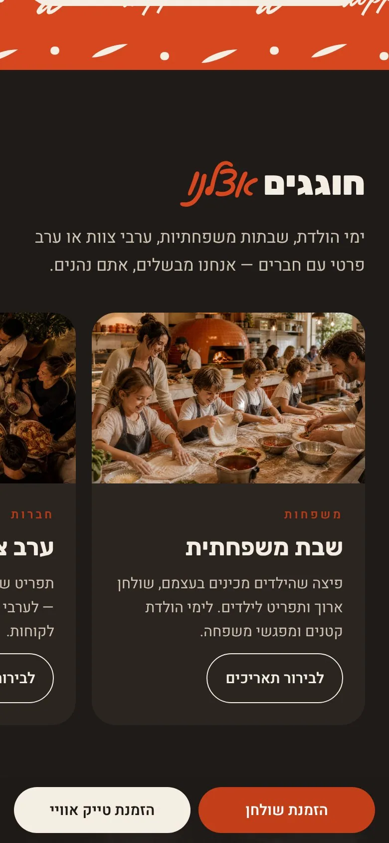
Events at night
06 · Events, night
Book · takeawayTwo actions on every screen; on phones, a sticky bar under the thumb.
The storyThe owners, the dough, San Marzano, fior di latte and pasta by hand.
Events & workshopsFamily Saturdays, team dinners, private nights and pasta classes.
EN / עבOne toggle switches language and direction, times stay left-to-right.

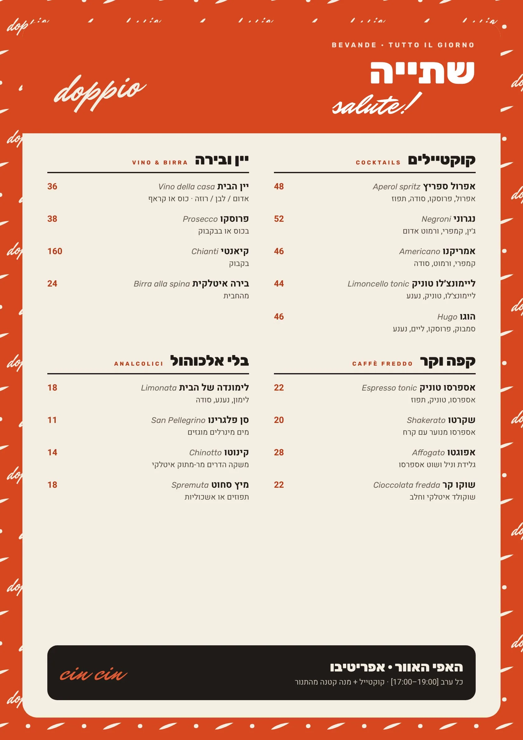
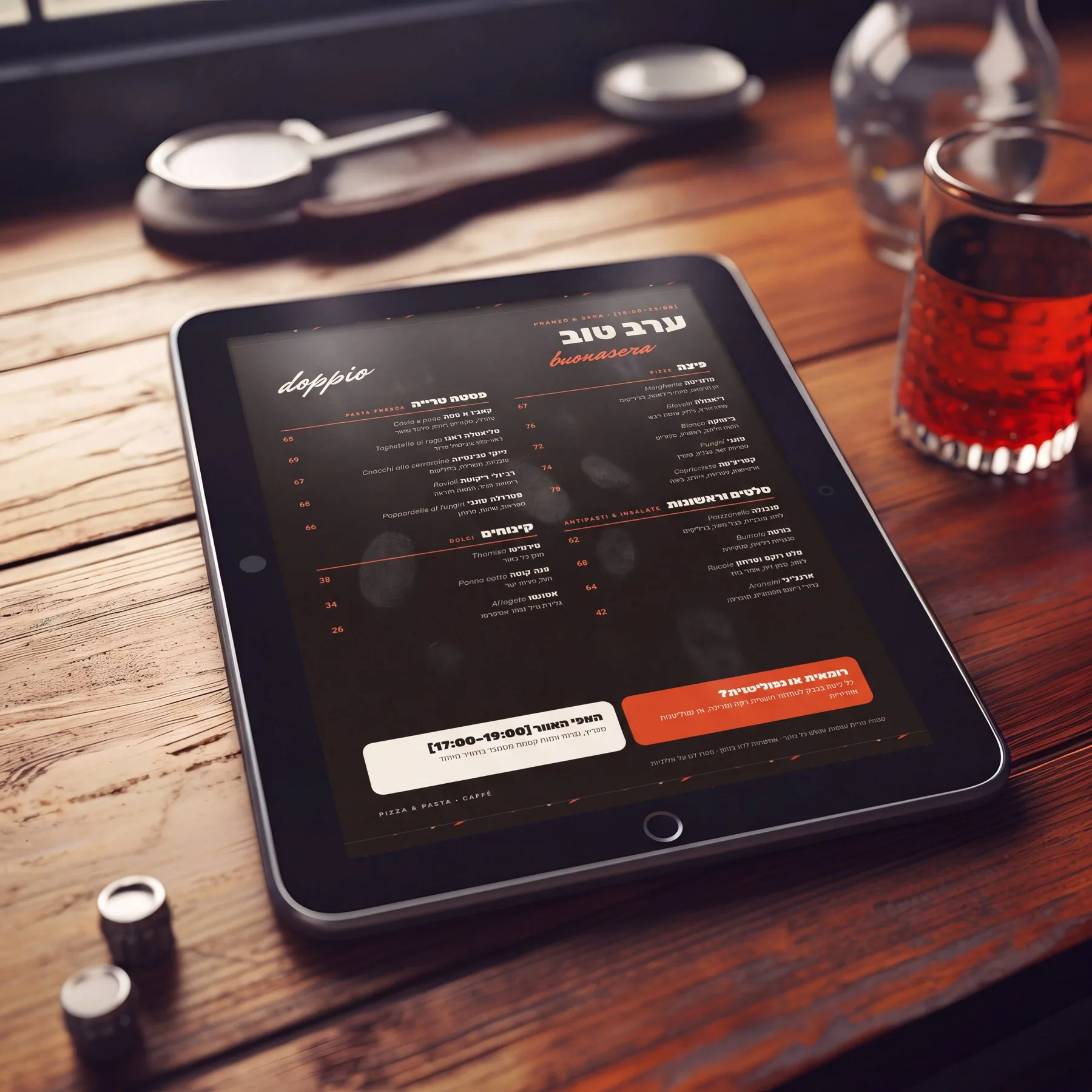
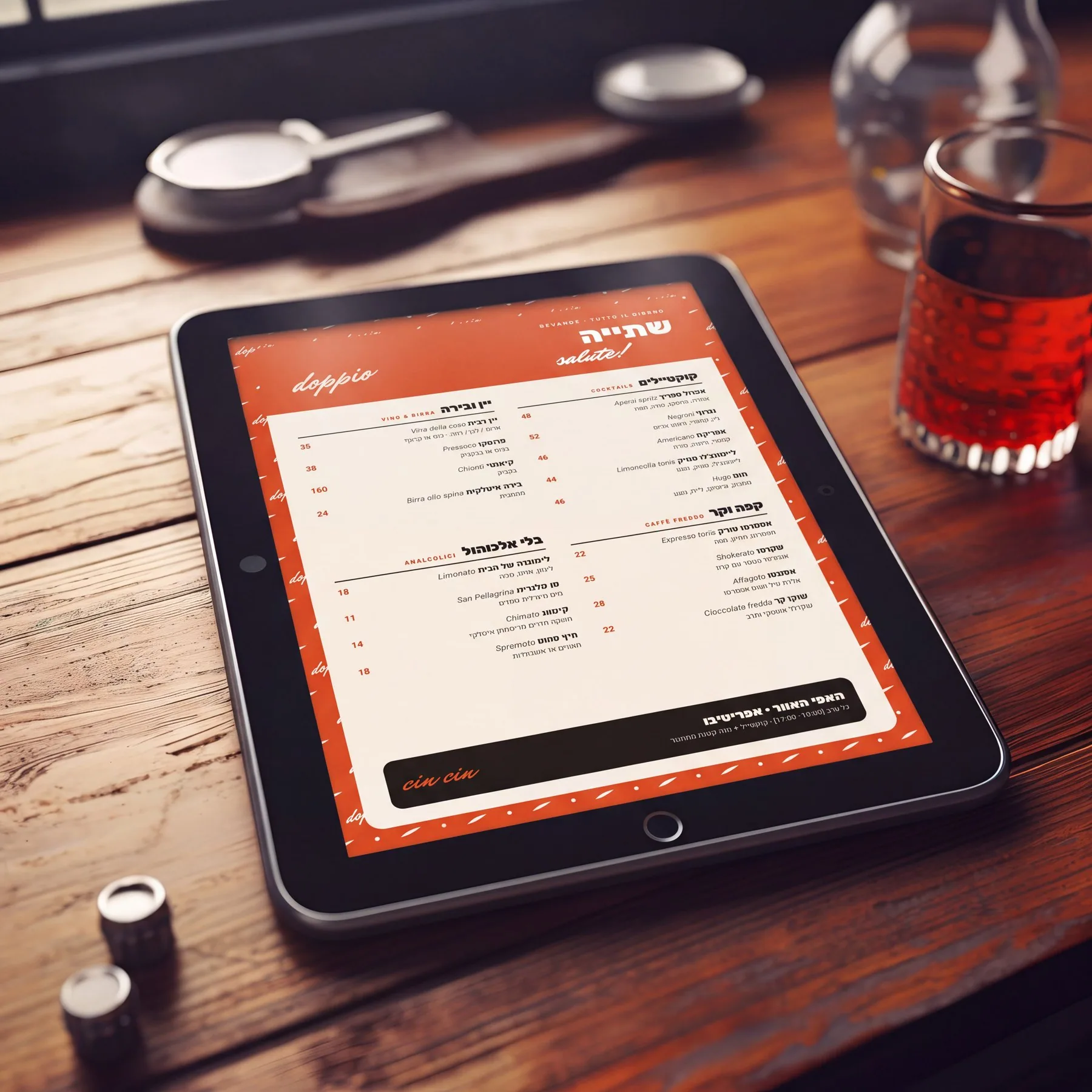
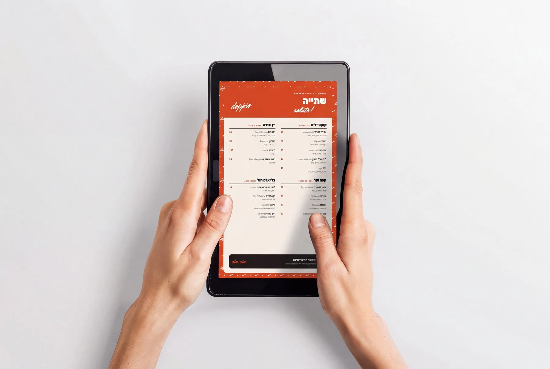
Three menus, three times of day.

Mattina on Farina, Pranzo & sera on Carbone, Bevande wrapped in the Brace pattern. Hebrew first, with the Italian name of each dish beside it.
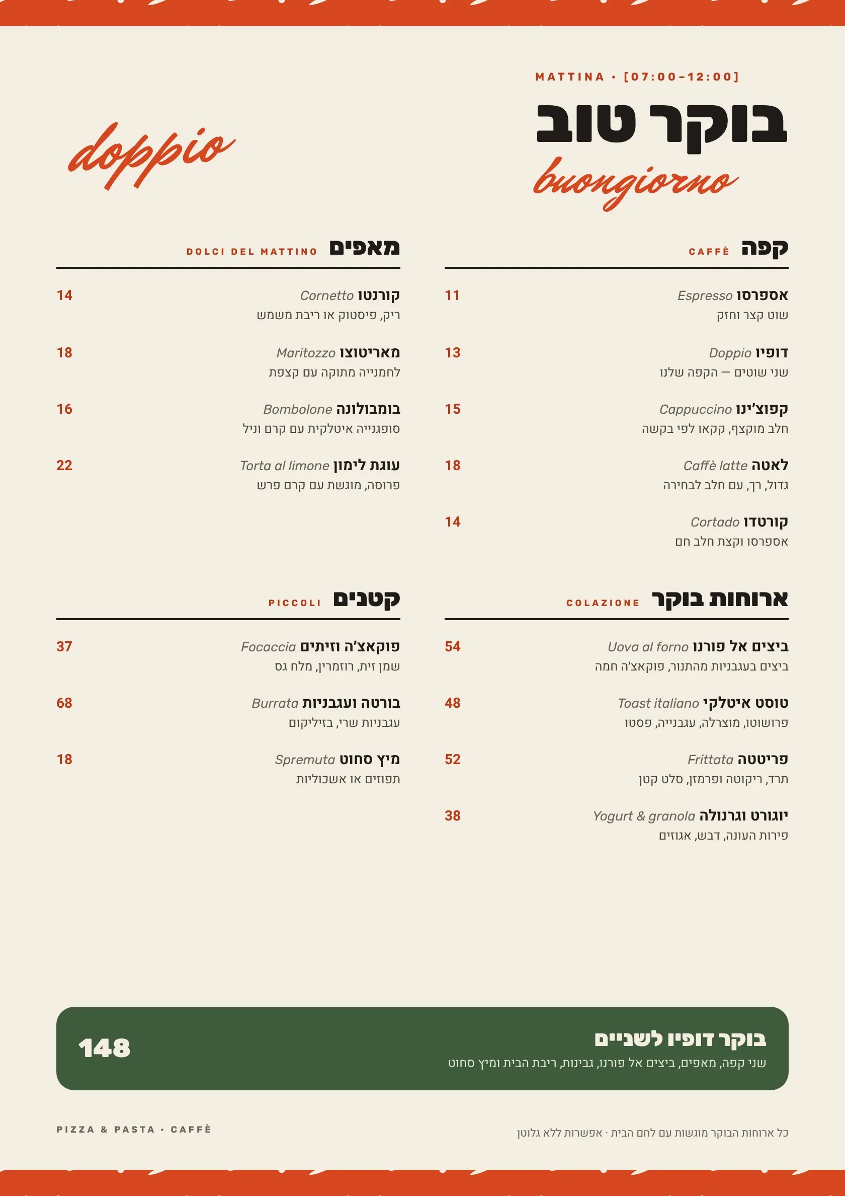
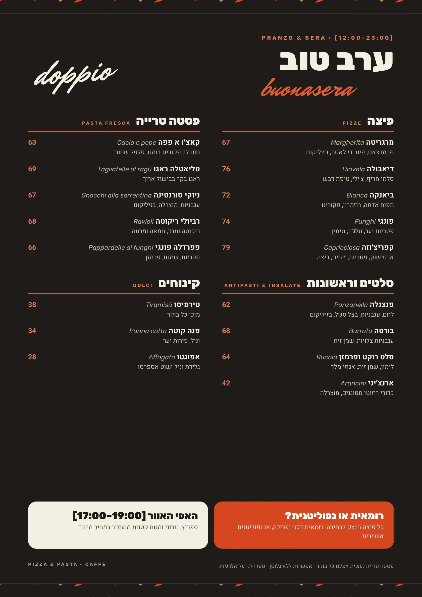
Breakfast menuLunch and dinner menuDrinks menu
The evening menu on a tablet at the table
The drinks menu on a tablet
Holding the drinks menu

Social, served fresh.

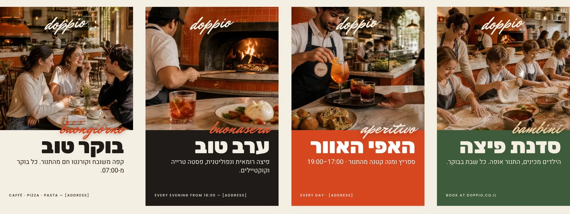
A real photo on top, a colour band that tells the time of day — Farina for coffee, Carbone for evenings, Brace for happy hour, Basilico for families. Happy hour, family Saturdays, boutique events and workshops, each with its own band.
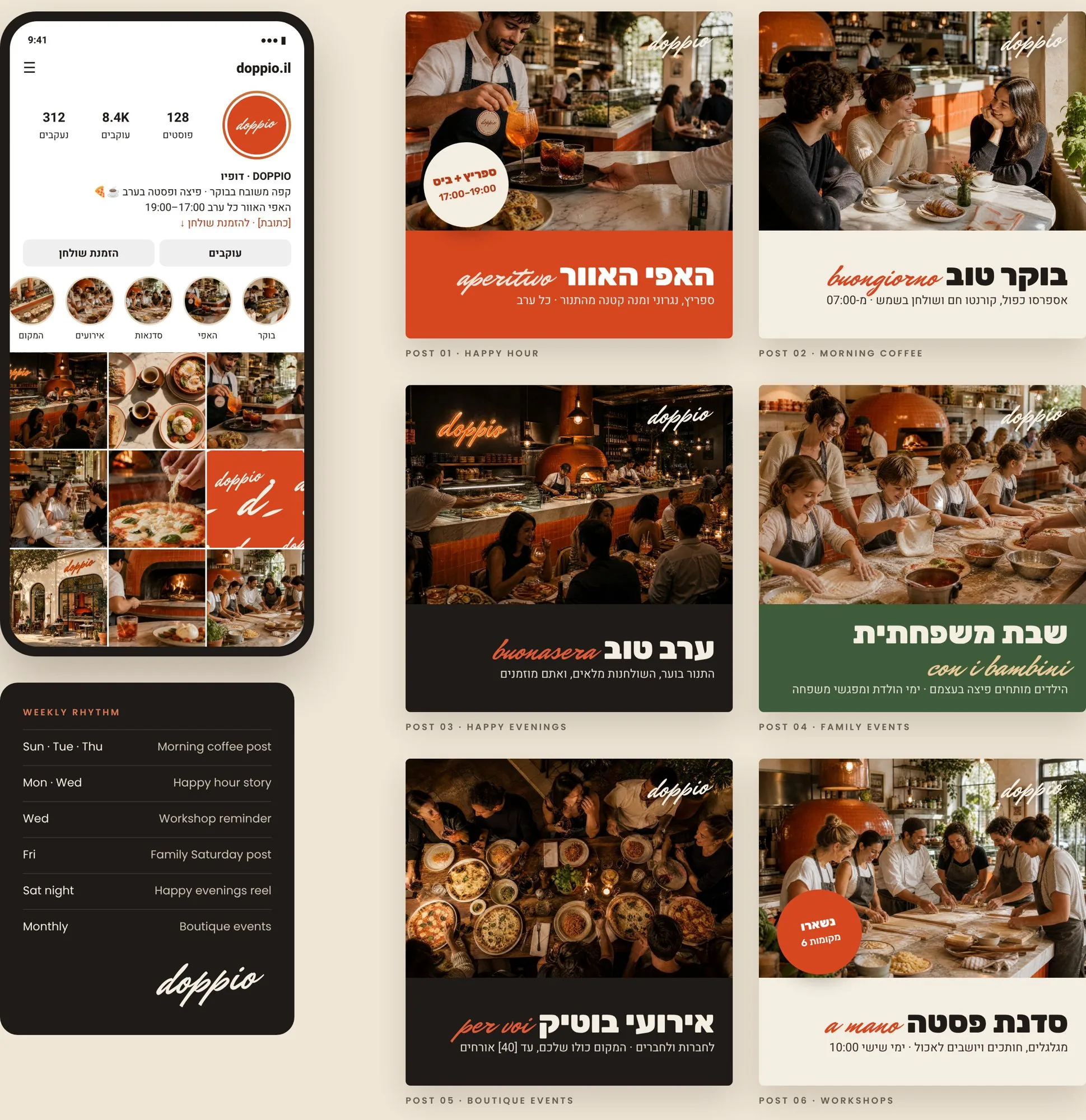
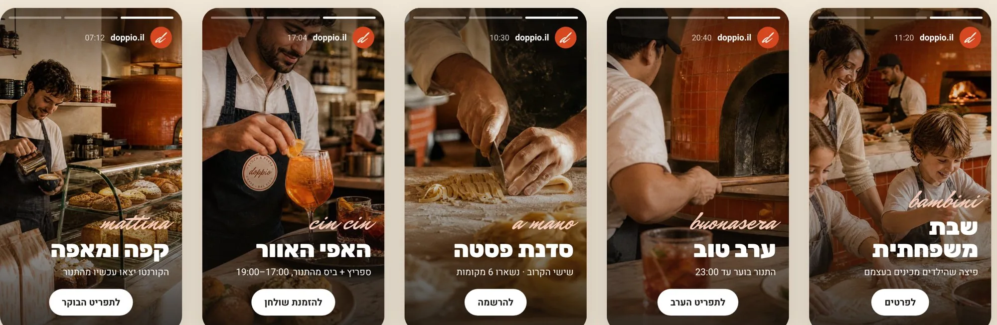
Instagram profile and six posts: happy hour, morning coffee, evenings, family events, boutique events and workshops Five Instagram stories

From the feed to the street.

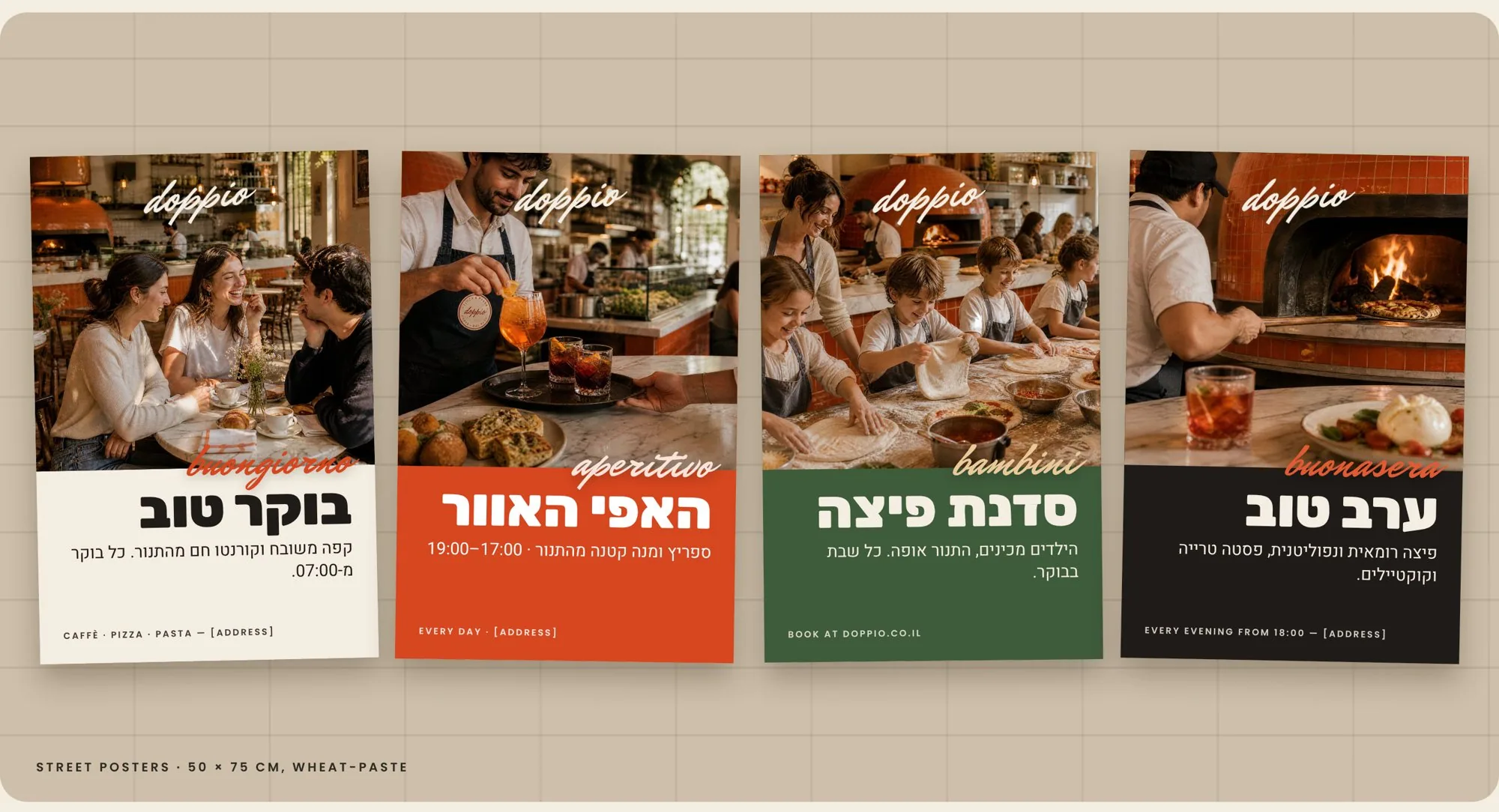
Four street posters: morning, evening, happy hour and the kids’ pizza workshop Wheat-paste posters on a street wall
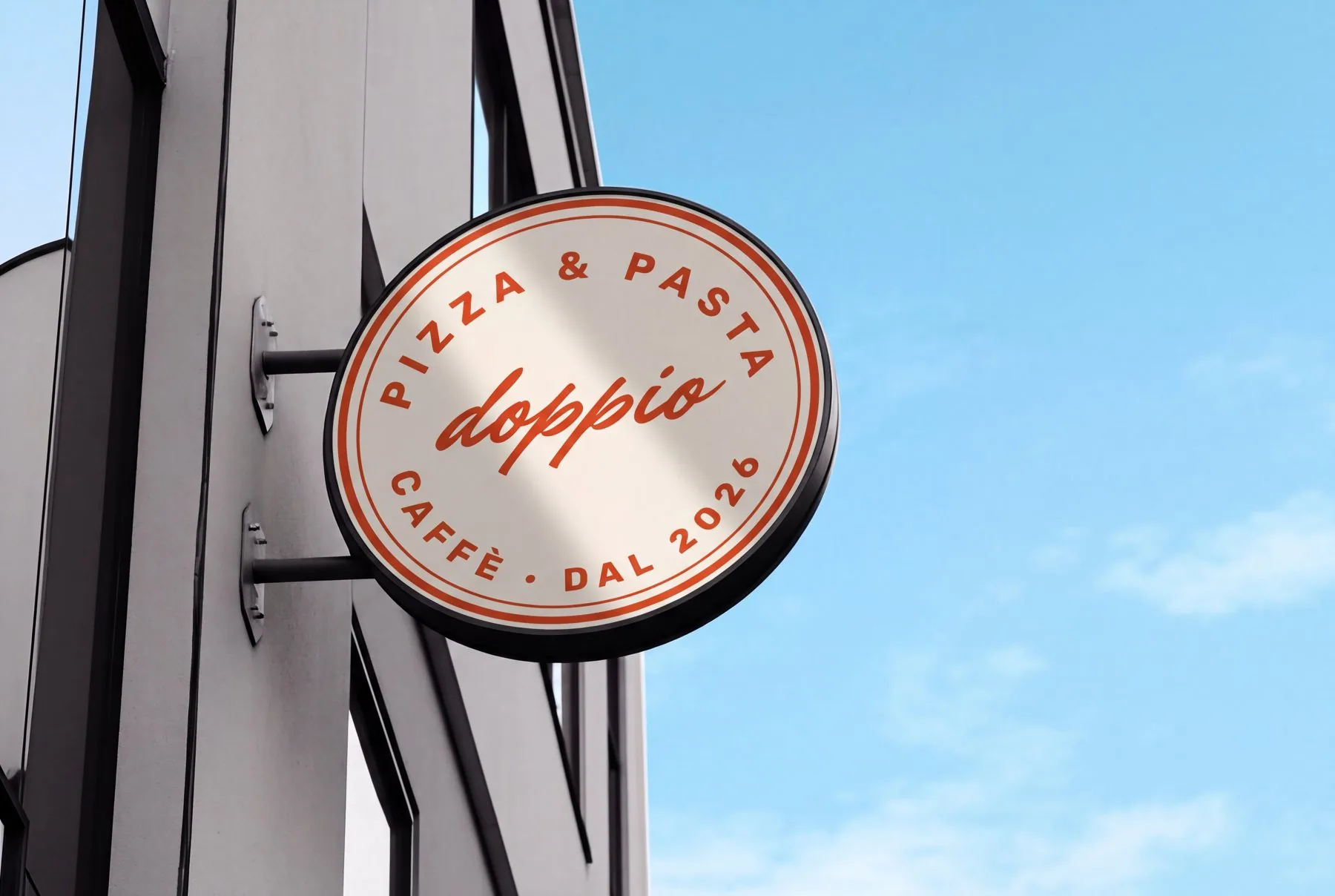
Round blade sign on the building: Pizza & pasta · Caffè · dal 2026
Fascia sign above the windows
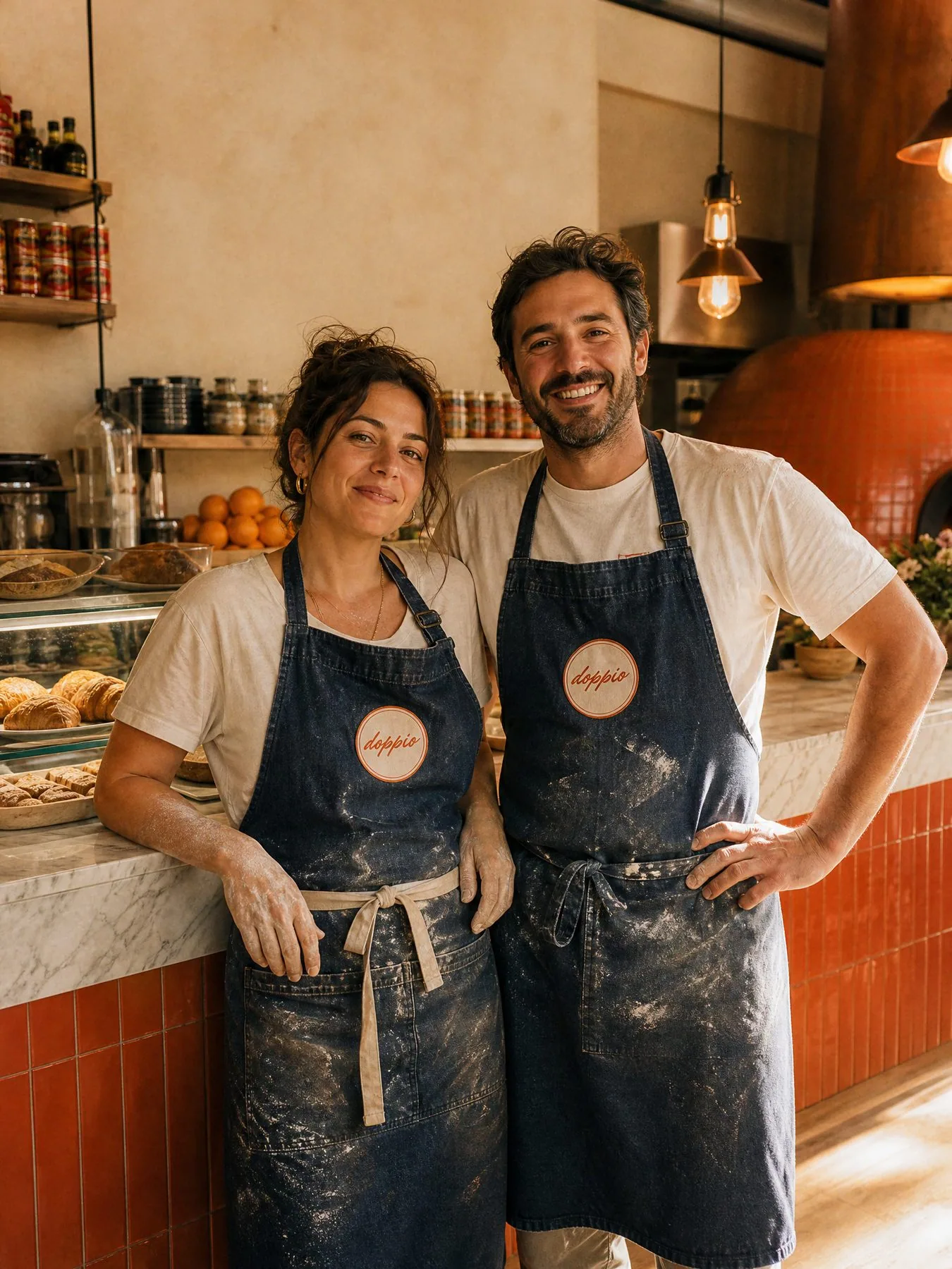
The owners in DOPPIO denim aprons with the round patch
Uniform

Dressed for the oven.

Washed denim aprons with a round Farina patch, a linen button-down for the floor and a cream tee for the kitchen. Flour on the hands is part of the look.
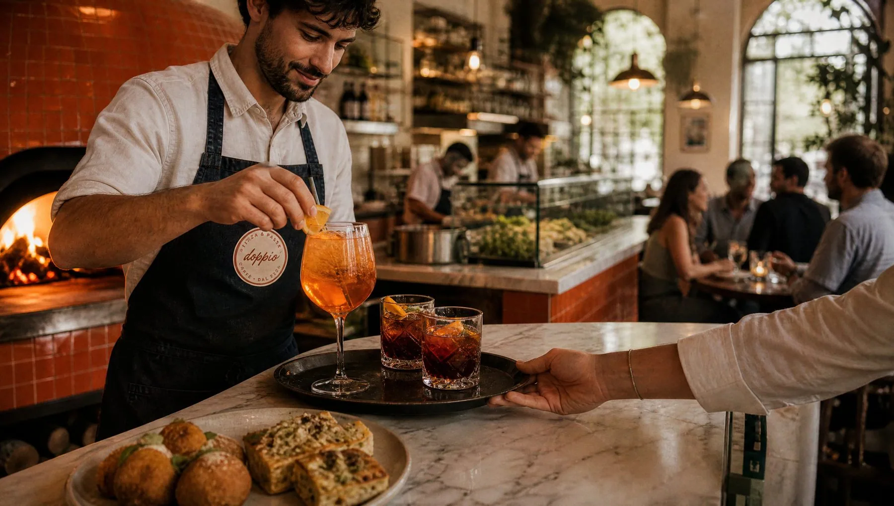
Bartender in the apron preparing an Aperol spritz
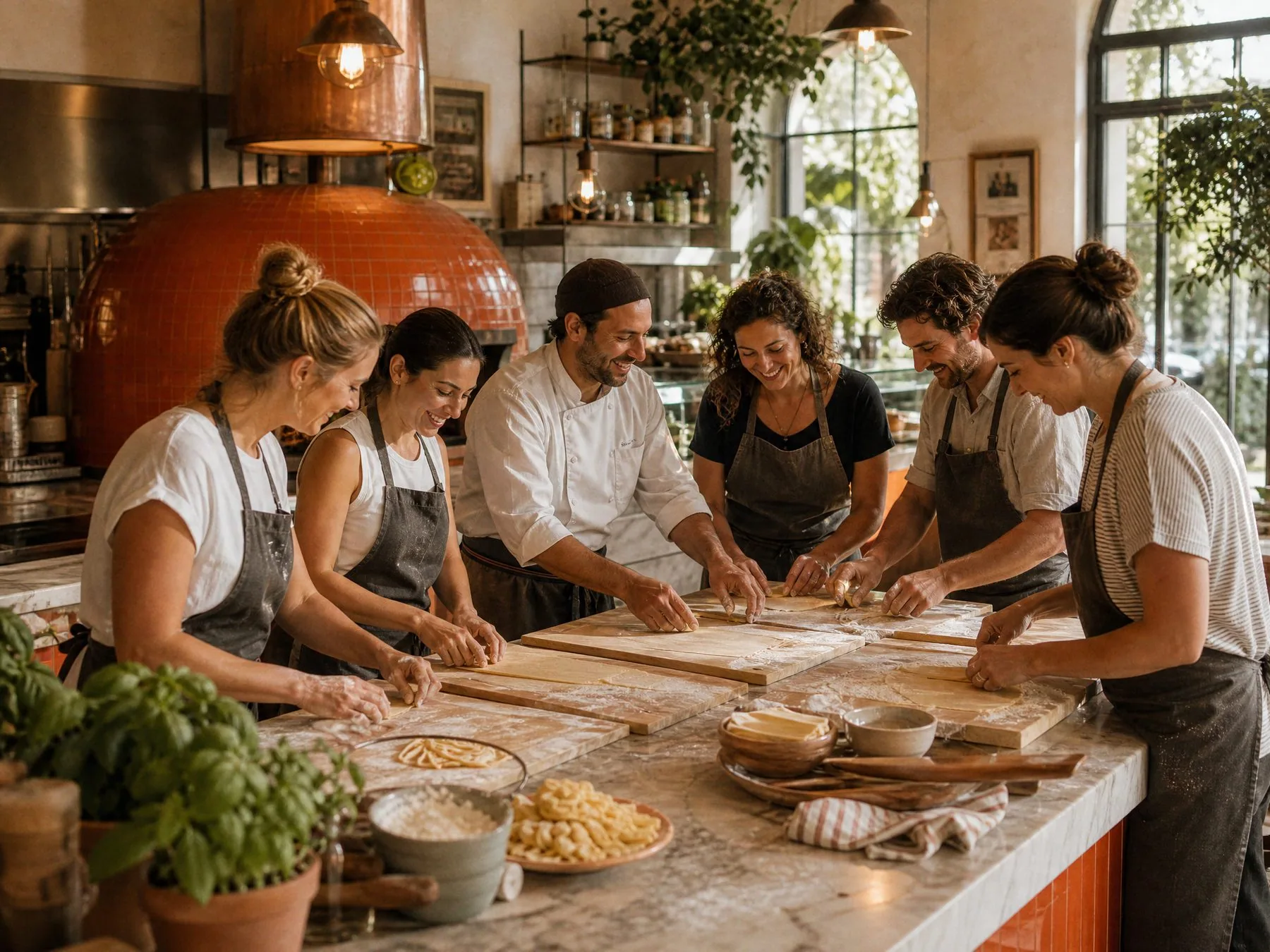
Pasta workshop in aprons
DOPPIO logo

Grazie mille.

Contact

Have a project in mind?

Tell me a little about the project and I'll get back to you within one working day to set up a short intro call.

taio.yourdesigner@gmail.com+972-54-258-8544

Herzliya, Israel · working with clients everywhere

Your details are used only to reply to you.