
ZEN 寿司禅 · LATE OMAKASE
The red sun, lit after dark.
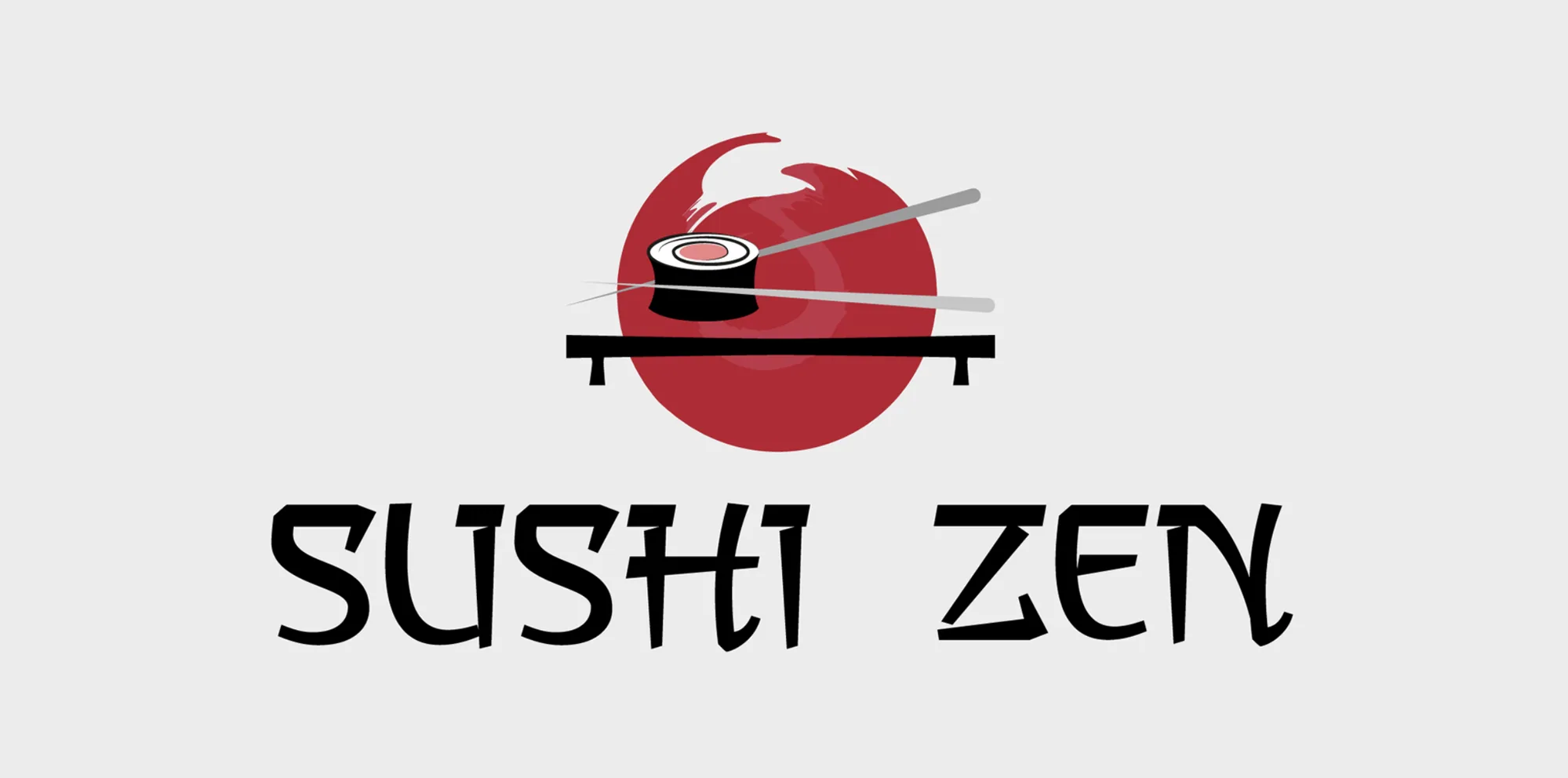
Sushi Zen started as a logo from my 30-day logo challenge in 2018: a red sun, a geta board, a sushi roll and chopsticks. Eight years later I rebuilt it as a real brand for a twelve-seat omakase counter in Berlin — urban, young, and glowing like Tokyo at night.
- Year
- 2018 · 2026
- Role
- Rebrand, identity, web UX/UI, print
- Deliverables
- 4 logo directions, neon mark & wordmark, palette, pattern, website, 3 menus, social, posters
- Tools
- [Figma, Illustrator]
Keep the sun. Lose the clichés.
What stays: the red sun and the counter. What goes: the literal roll and chopsticks, the gradient brush and the chop-suey lettering — the shortcuts that made the old logo look like every other sushi place.
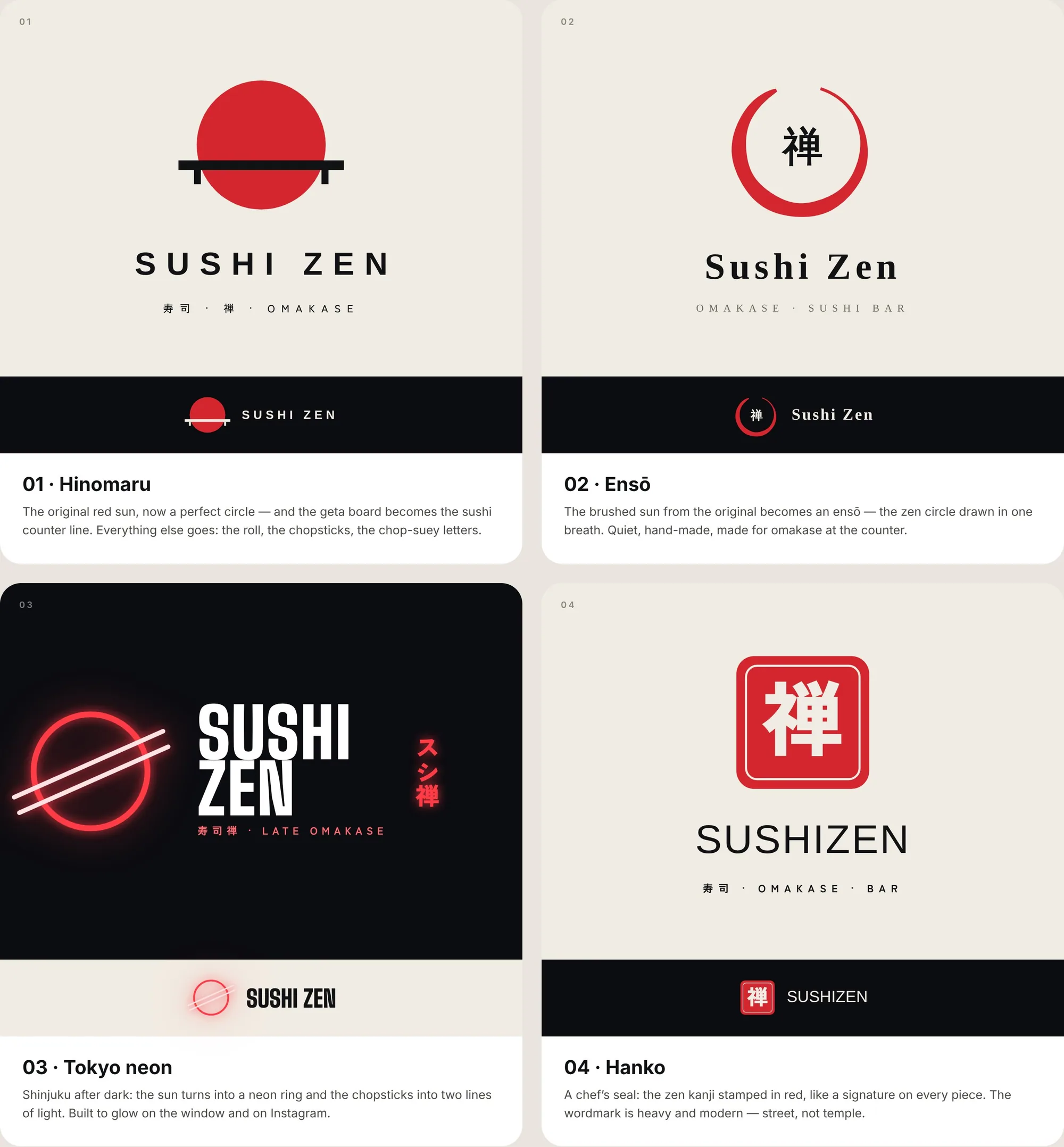
Four ways to refresh the red sun.
Hinomaru, Ensō, Tokyo neon and Hanko. Each keeps the sun but tells a different story — from temple-quiet to street-loud. Tokyo neon won: it suits a young, late-night crowd and glows on the window and on Instagram.
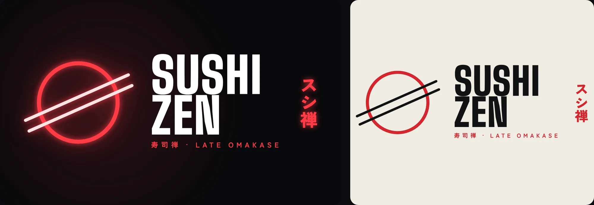
One ring, two lines of light.
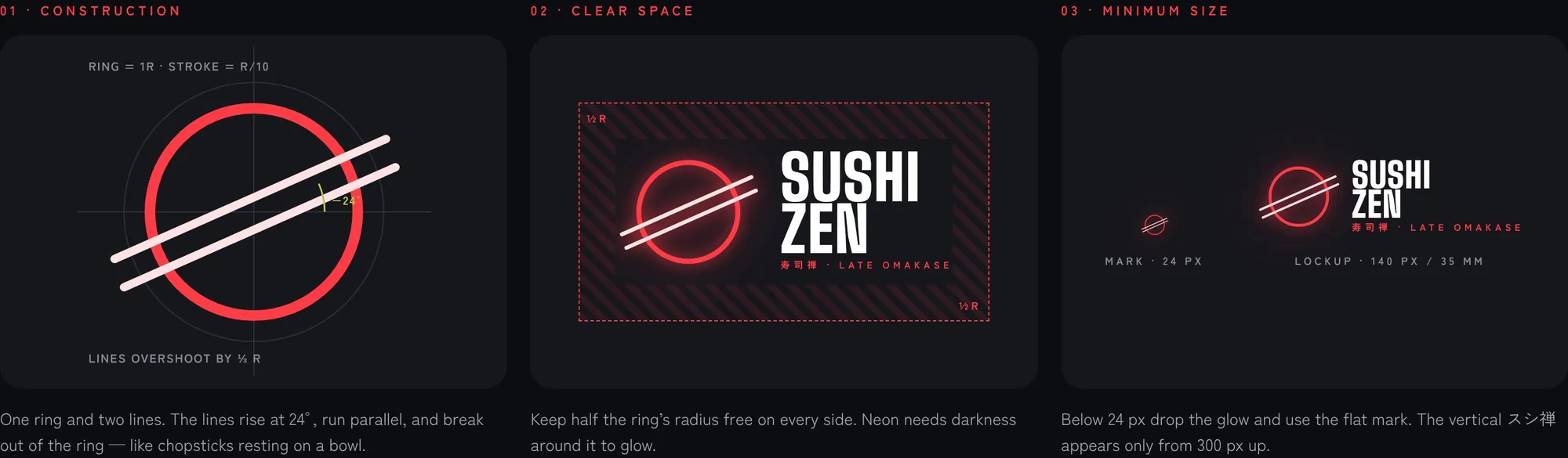
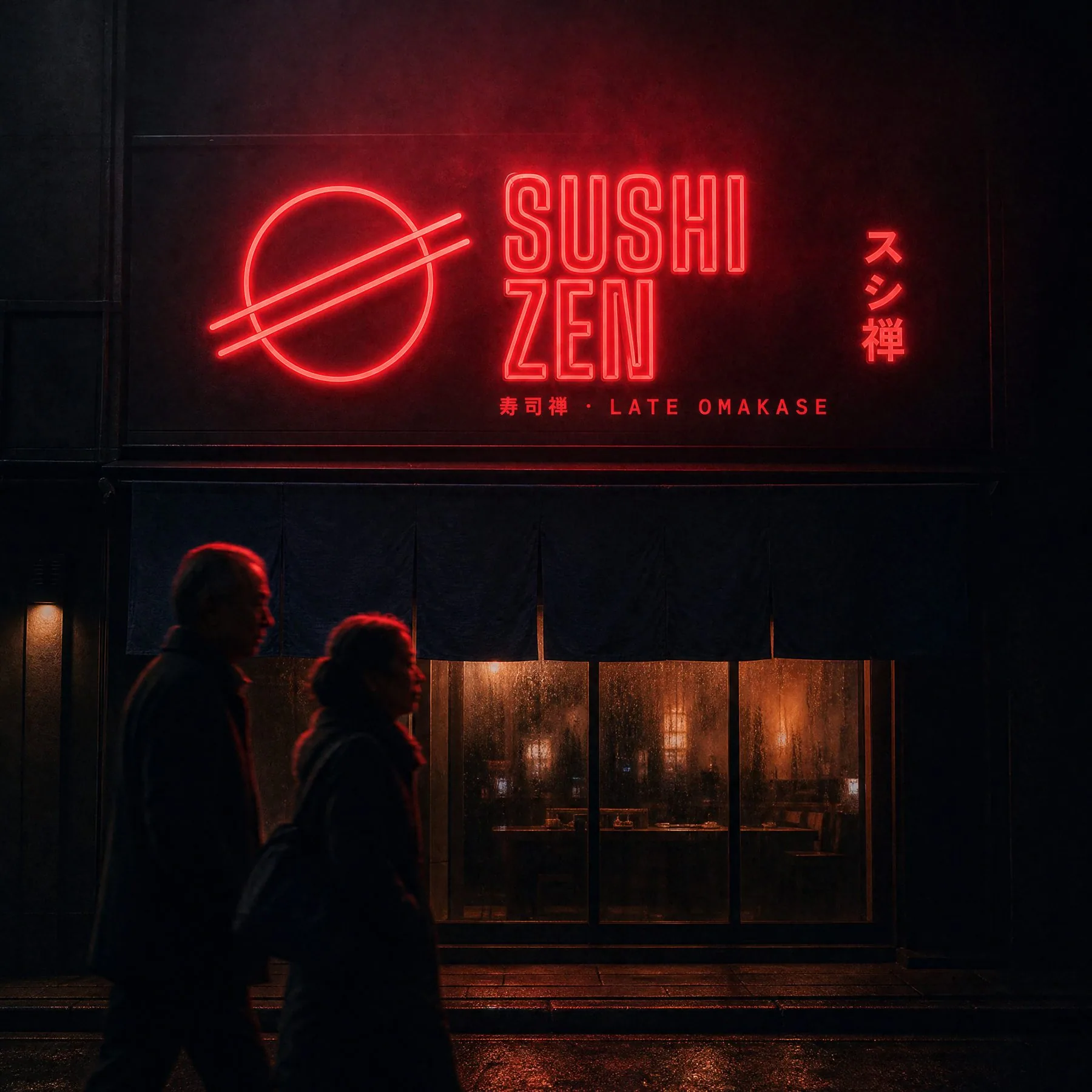
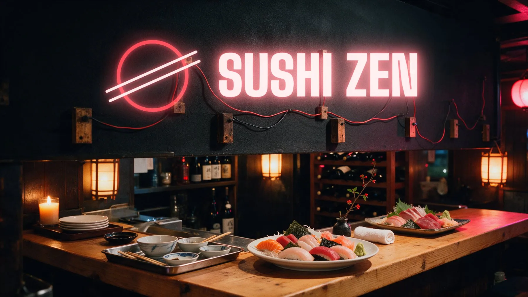
The sun becomes a neon ring. The chopsticks become two parallel lines rising at 24° that break out of the ring, like chopsticks resting on a bowl. The wordmark is set in tall condensed caps, like Shinjuku signage.
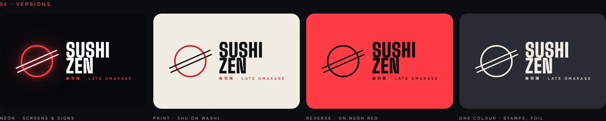
Night is the ground. Red is the light.
Neon and Sakura only ever appear as light. On paper the same red becomes Shu, the colour of a chef’s seal. Wasabi is a single detail — a price, a dot, a sticker.
Yoru no machi — a city at night.
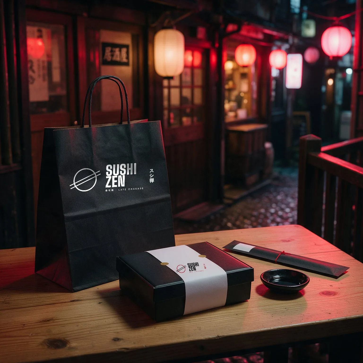
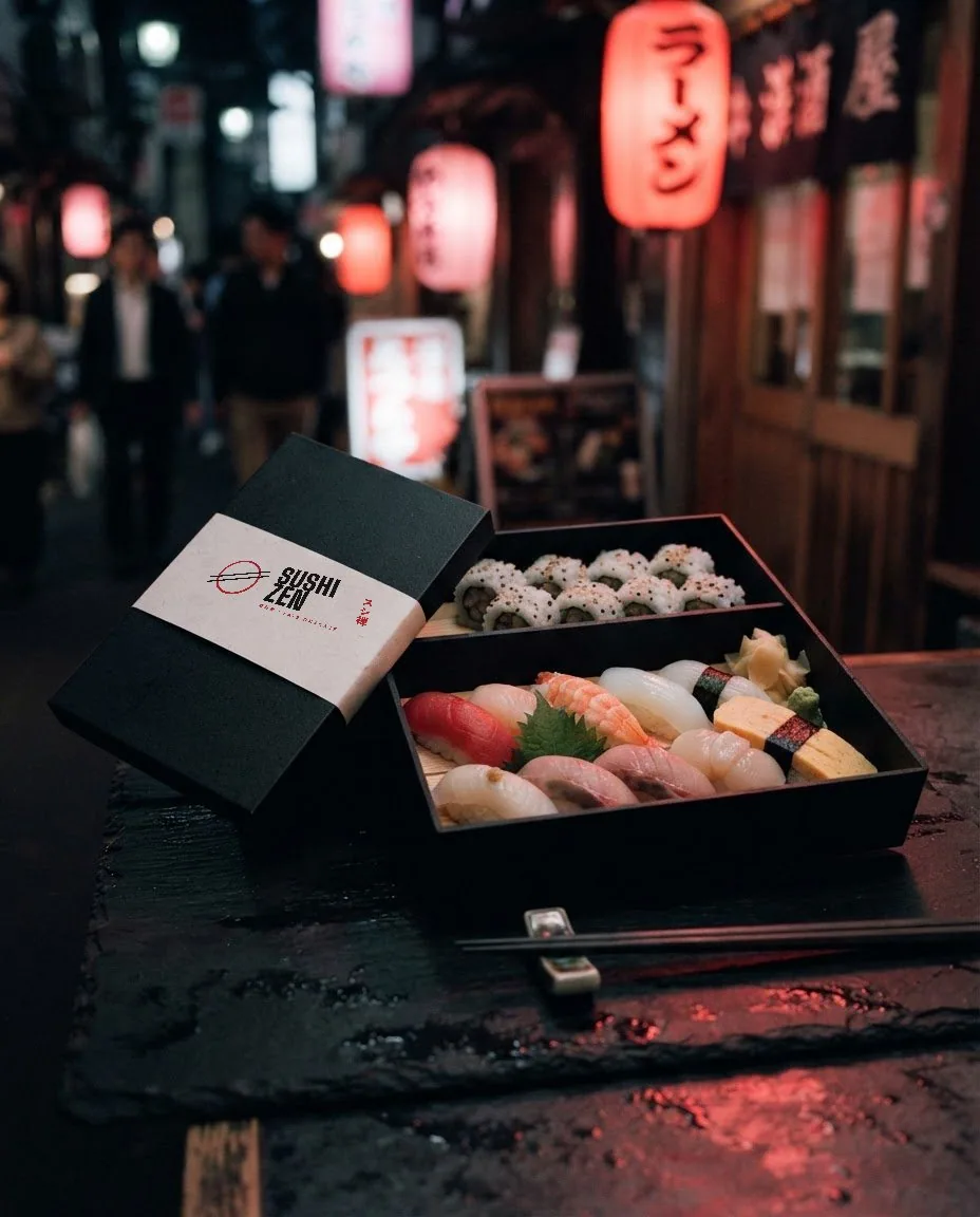
The mark, 寿司禅 and dots of light, repeated like windows in an alley. One pattern in three moods, for bags, boxes, tape, chopstick sleeves and walls.
Twelve seats, one chef.
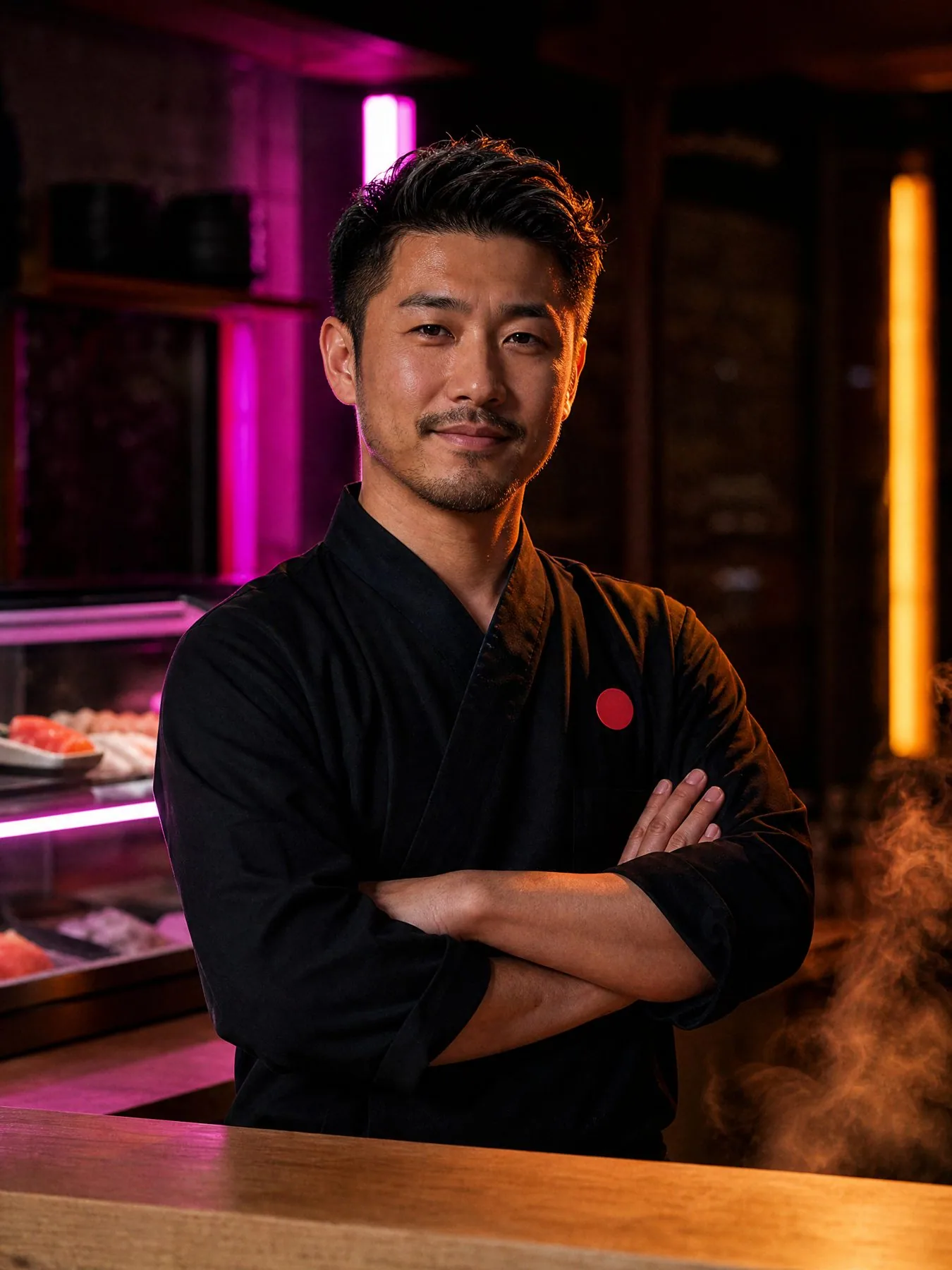
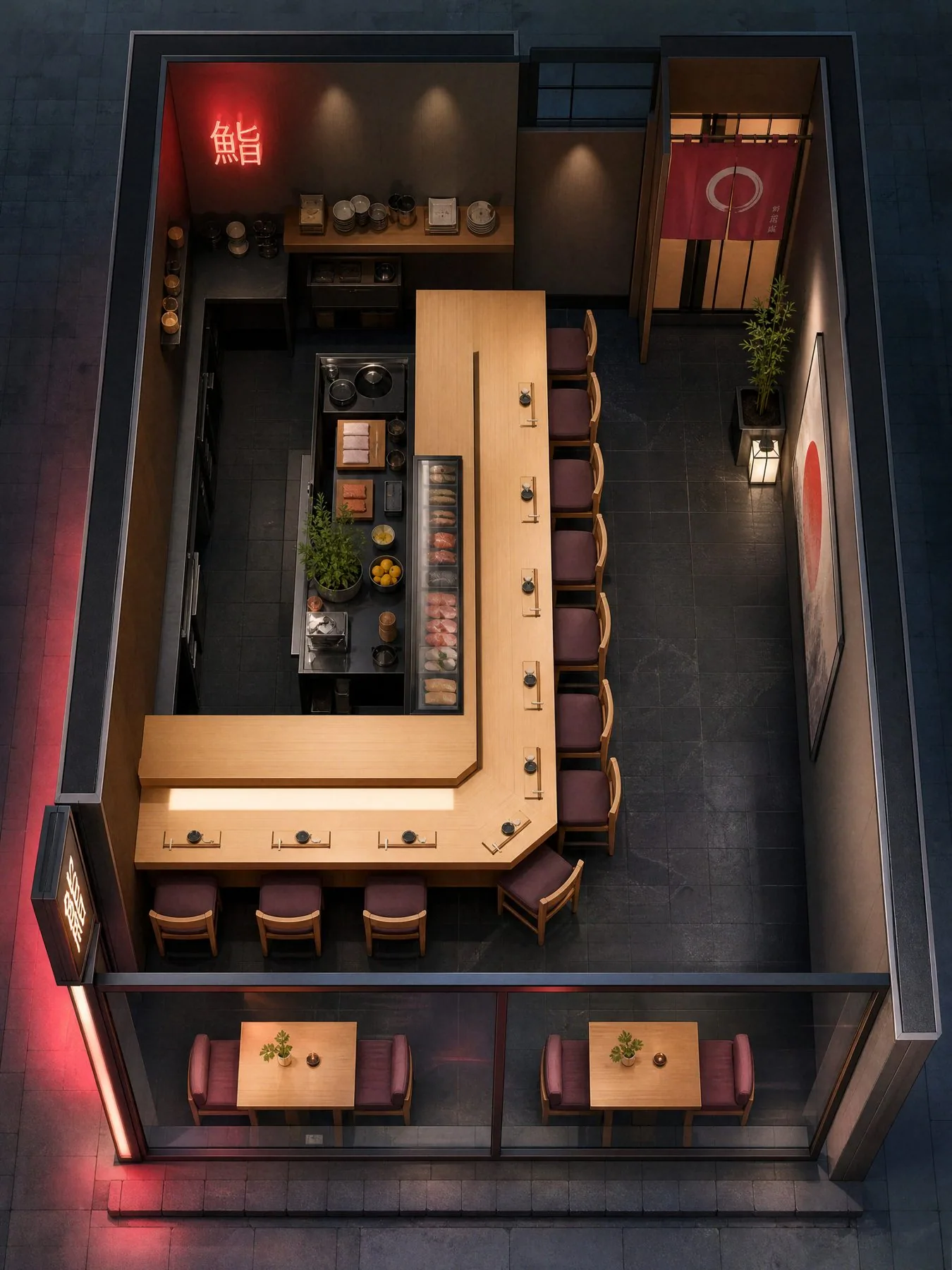
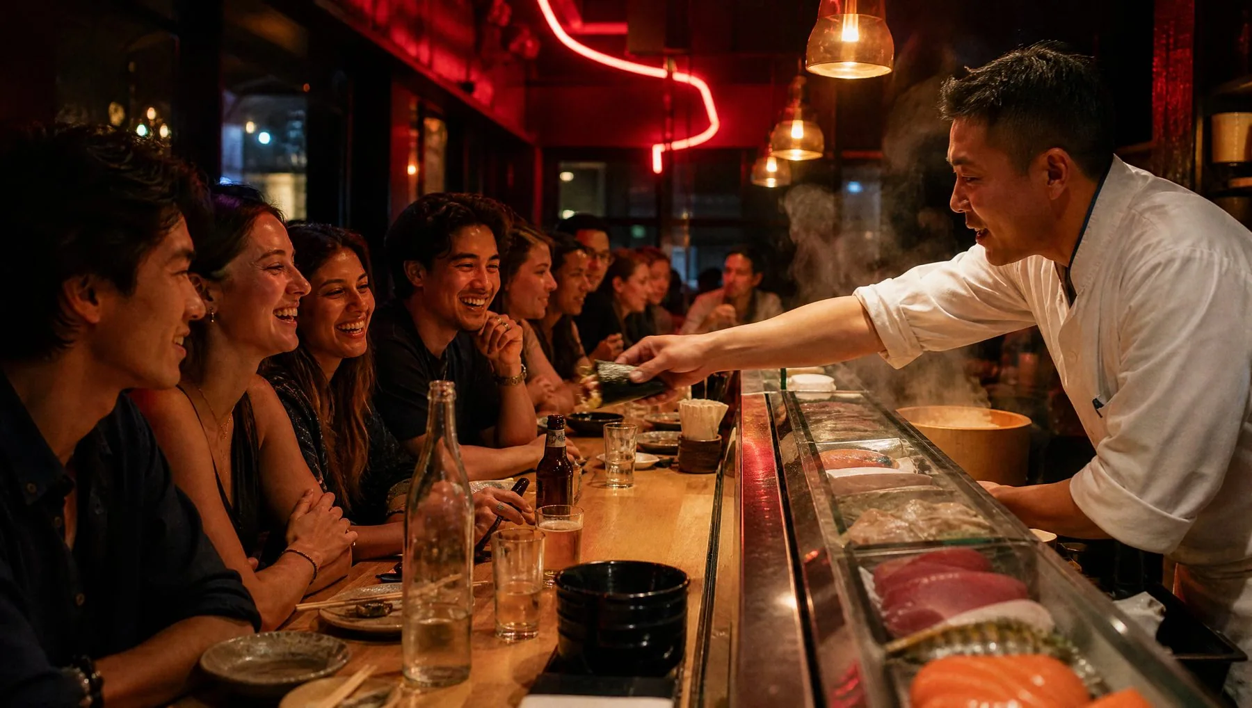
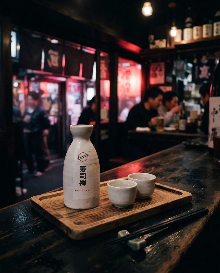
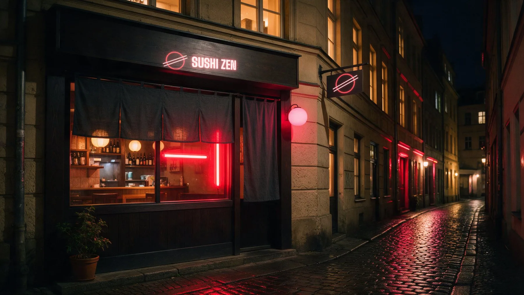
I art-directed the room as part of the brand: one pale hinoki counter, the neon ring above the chef, lanterns and sake lit from below. Every photo and loop here was generated from my prompt sheet.
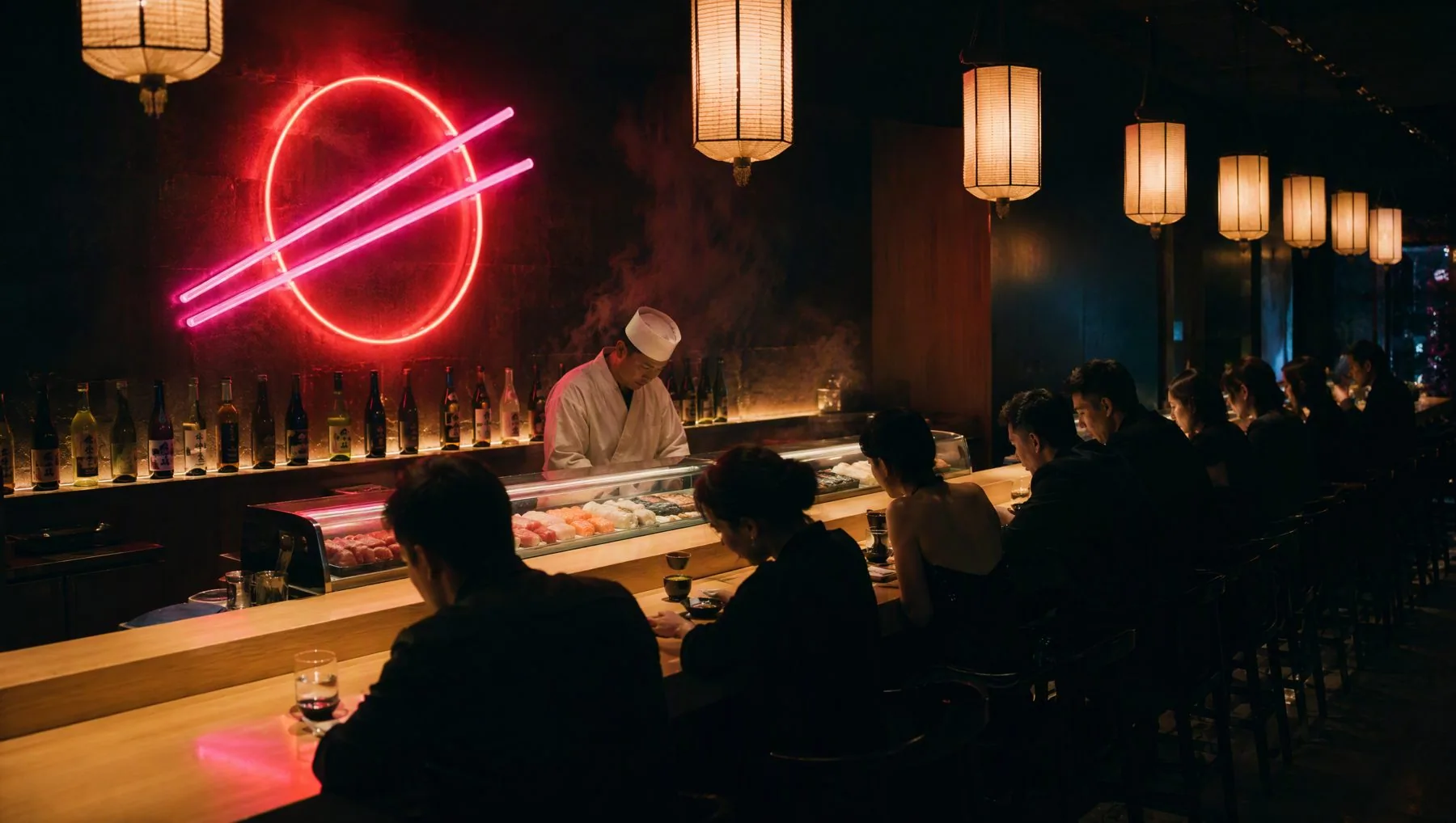
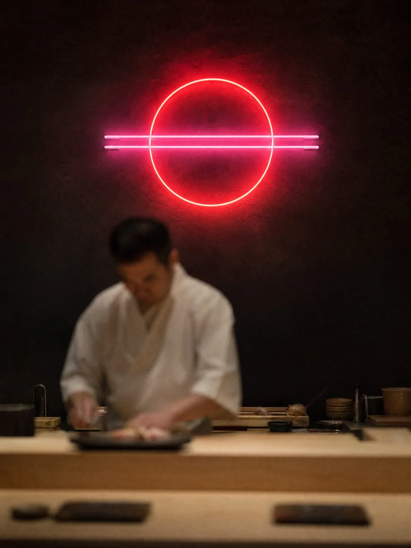
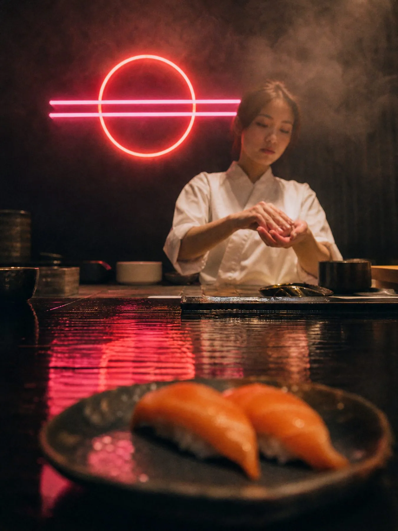
Dinner, then late night.
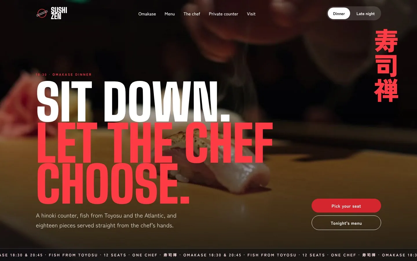
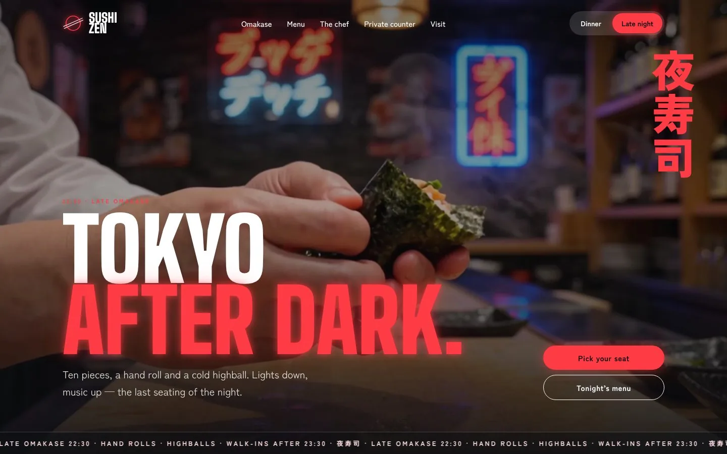
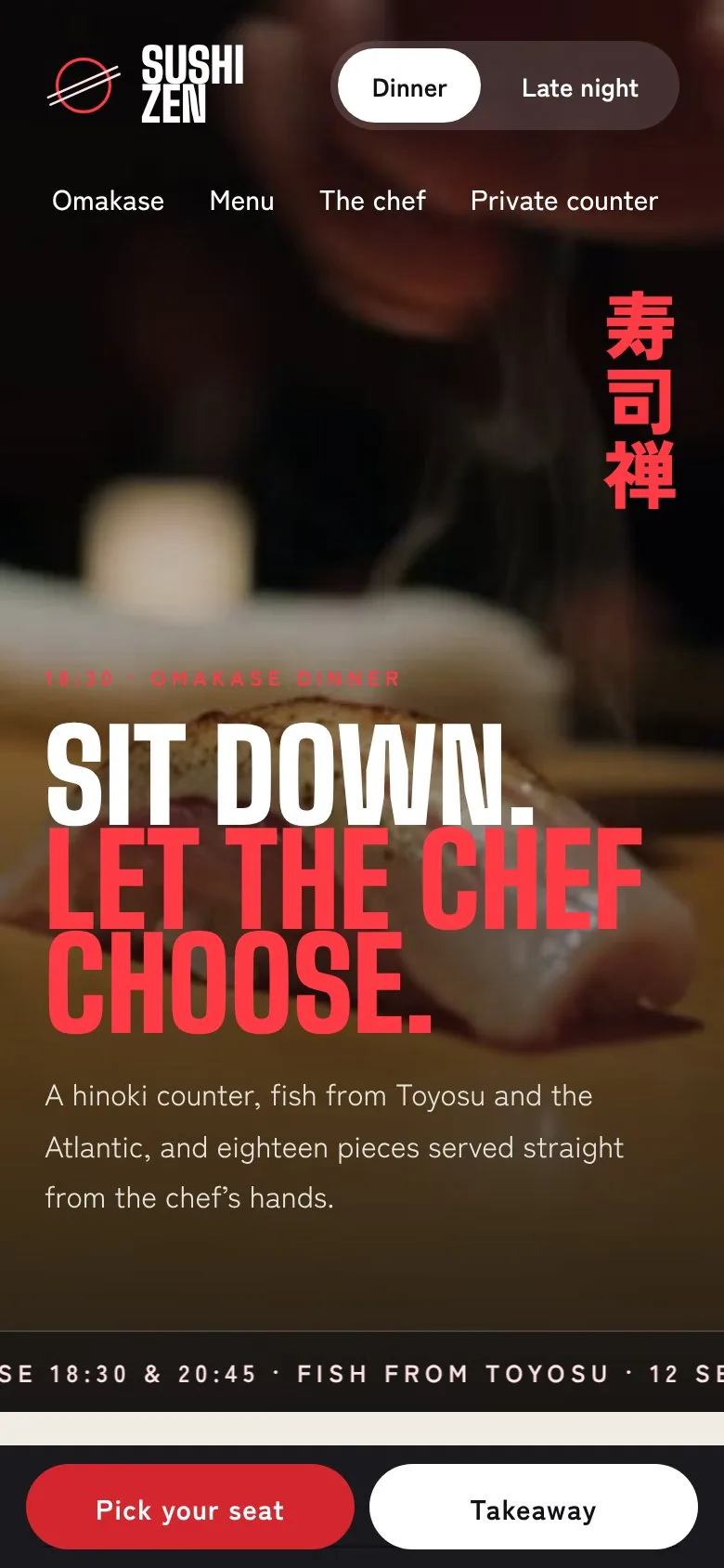
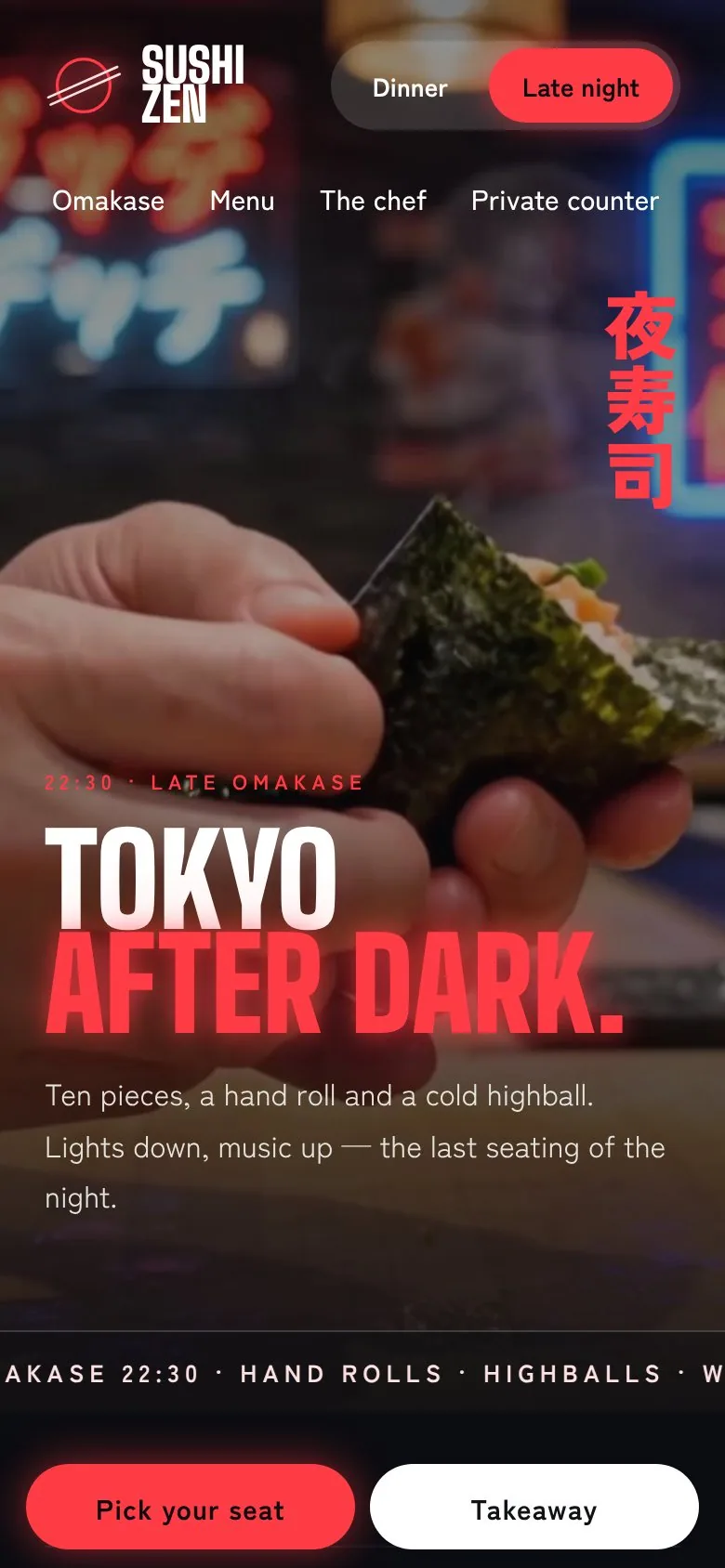
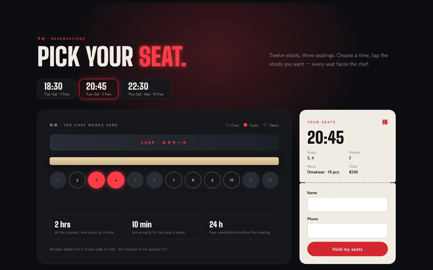
The website has two moods. A toggle in the header switches from the calm omakase dinner to the late-night counter — the page goes dark and the red starts to glow. Booking is a seat map of the twelve-seat counter.
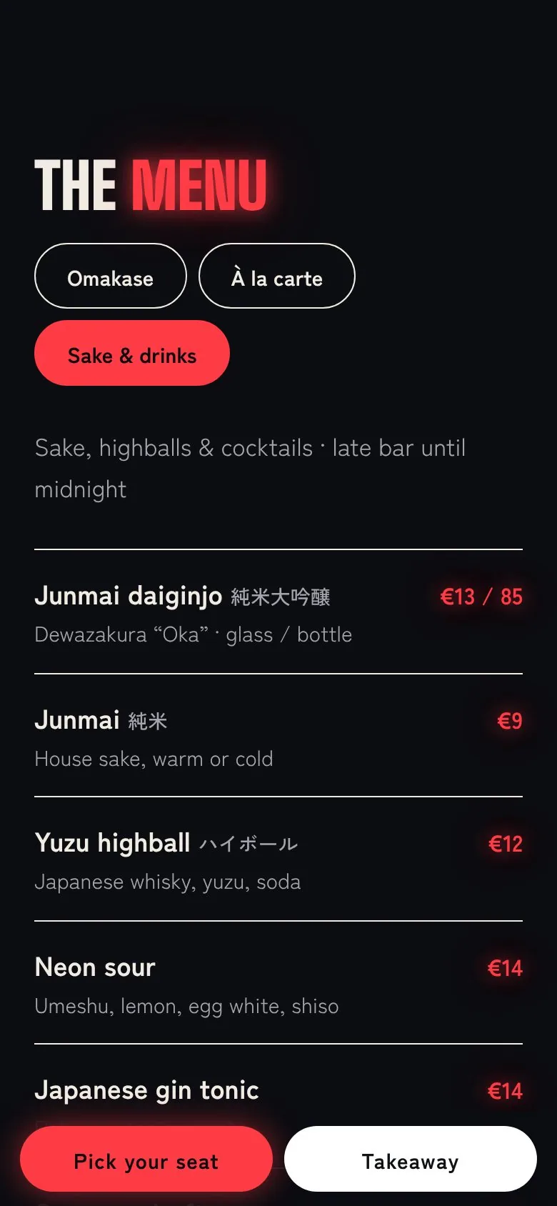
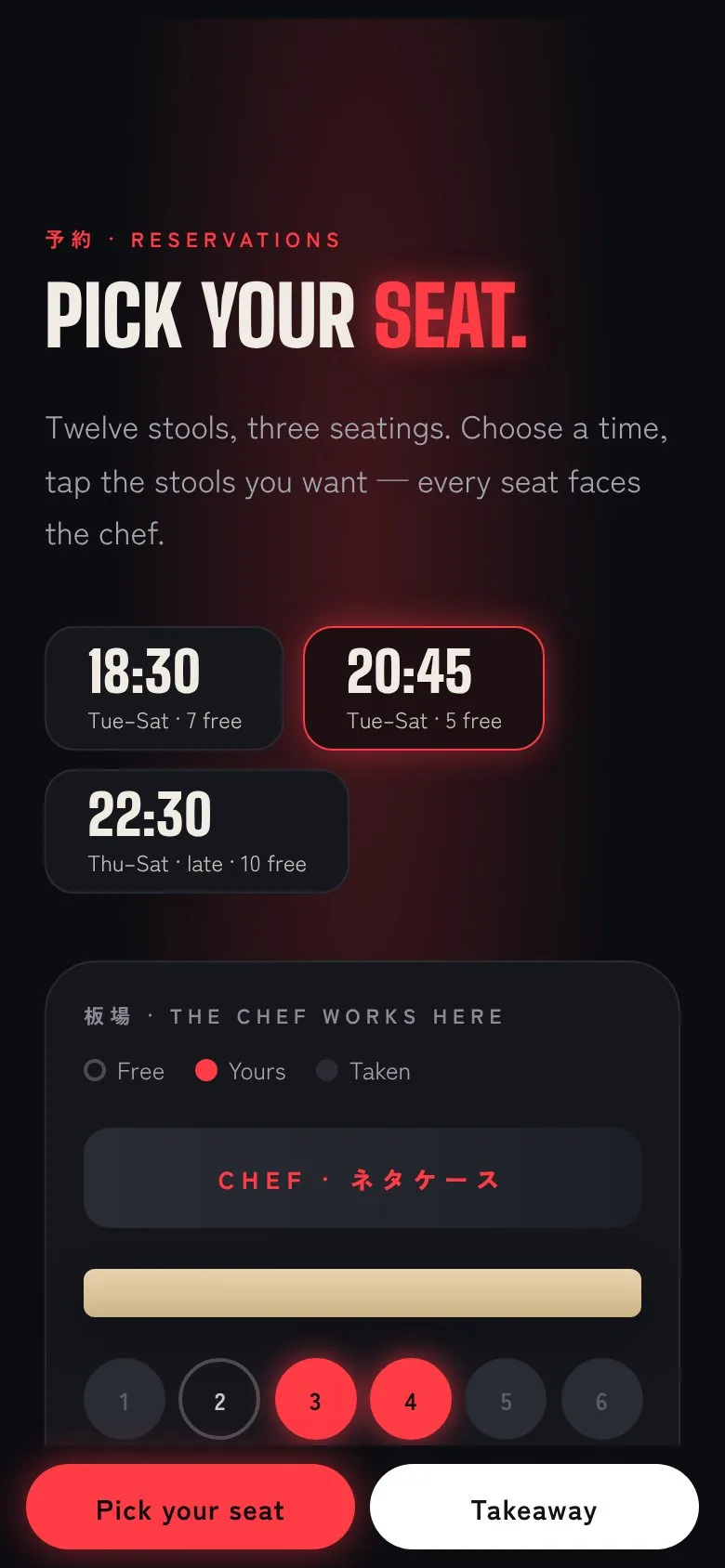
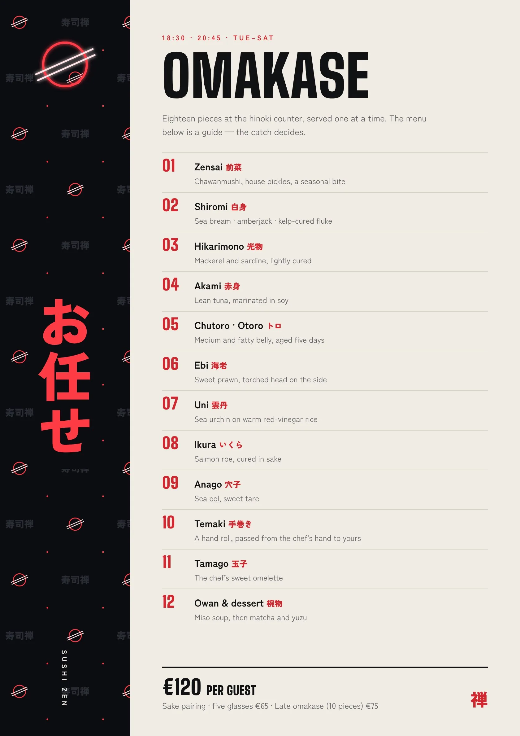
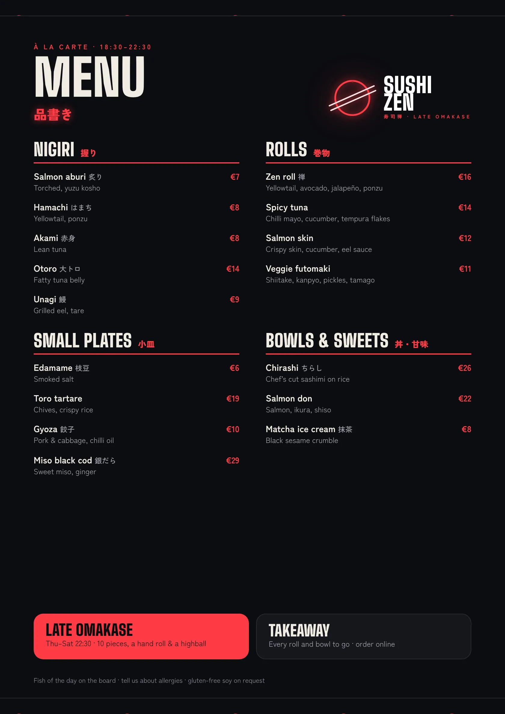
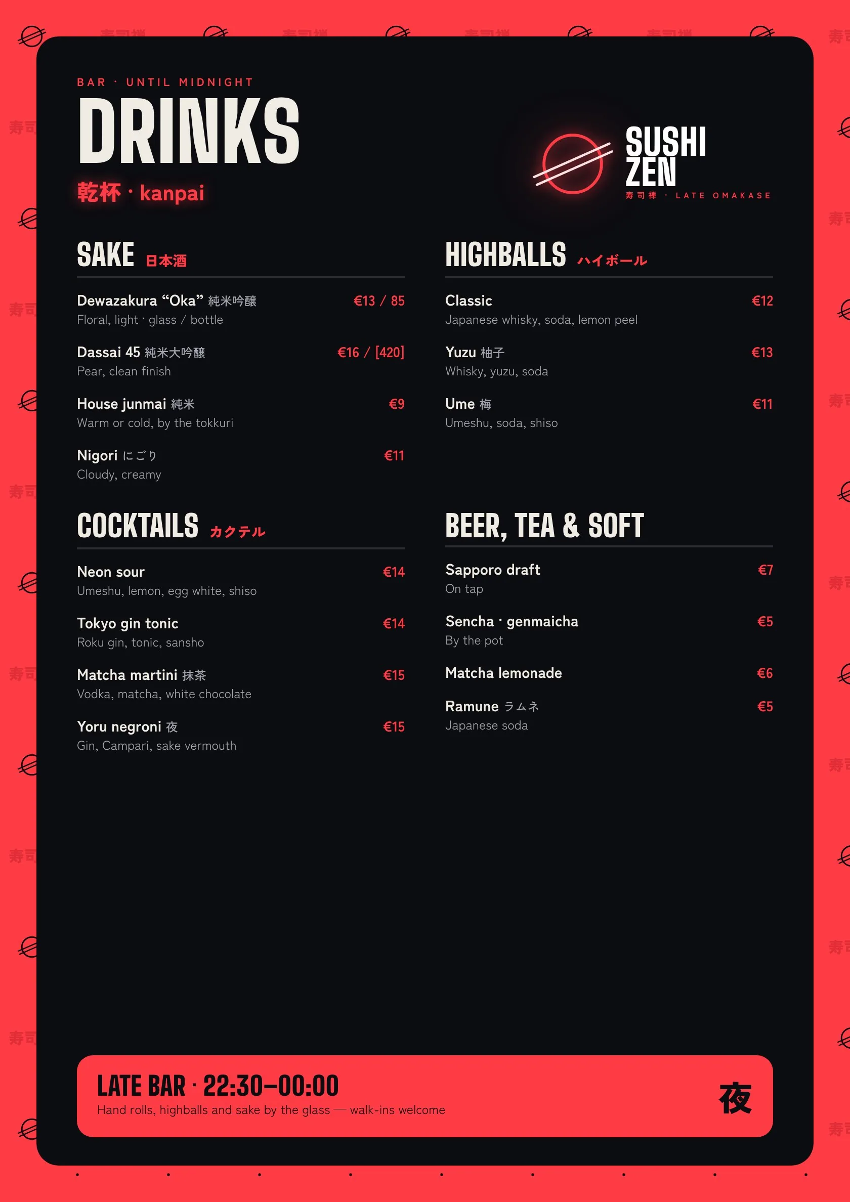
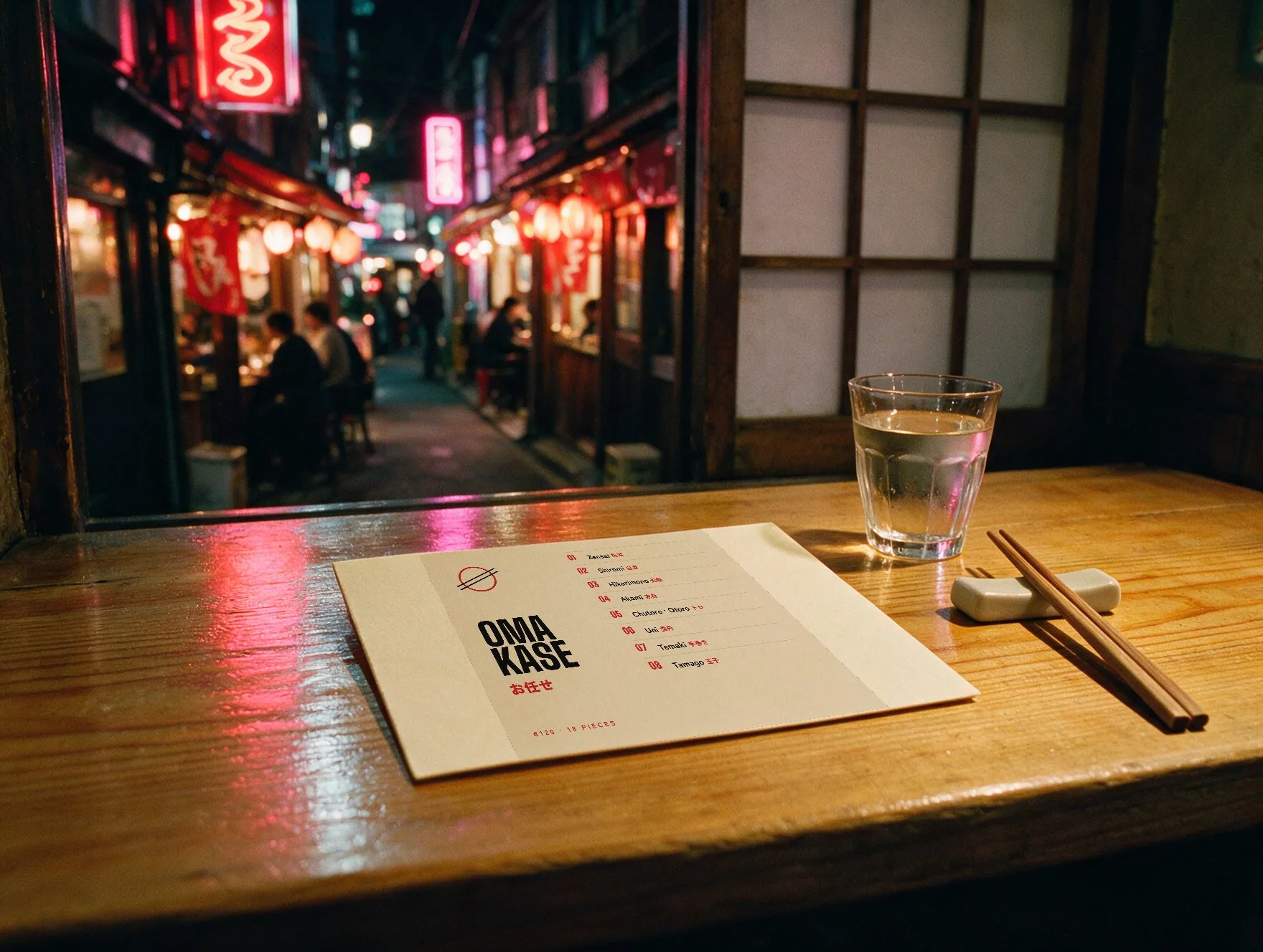
Three menus, one counter.
Omakase on washi with a vertical お任せ, à la carte on night black, and drinks framed in neon. Prices in euros, A4 for print.
The brand, in the room.
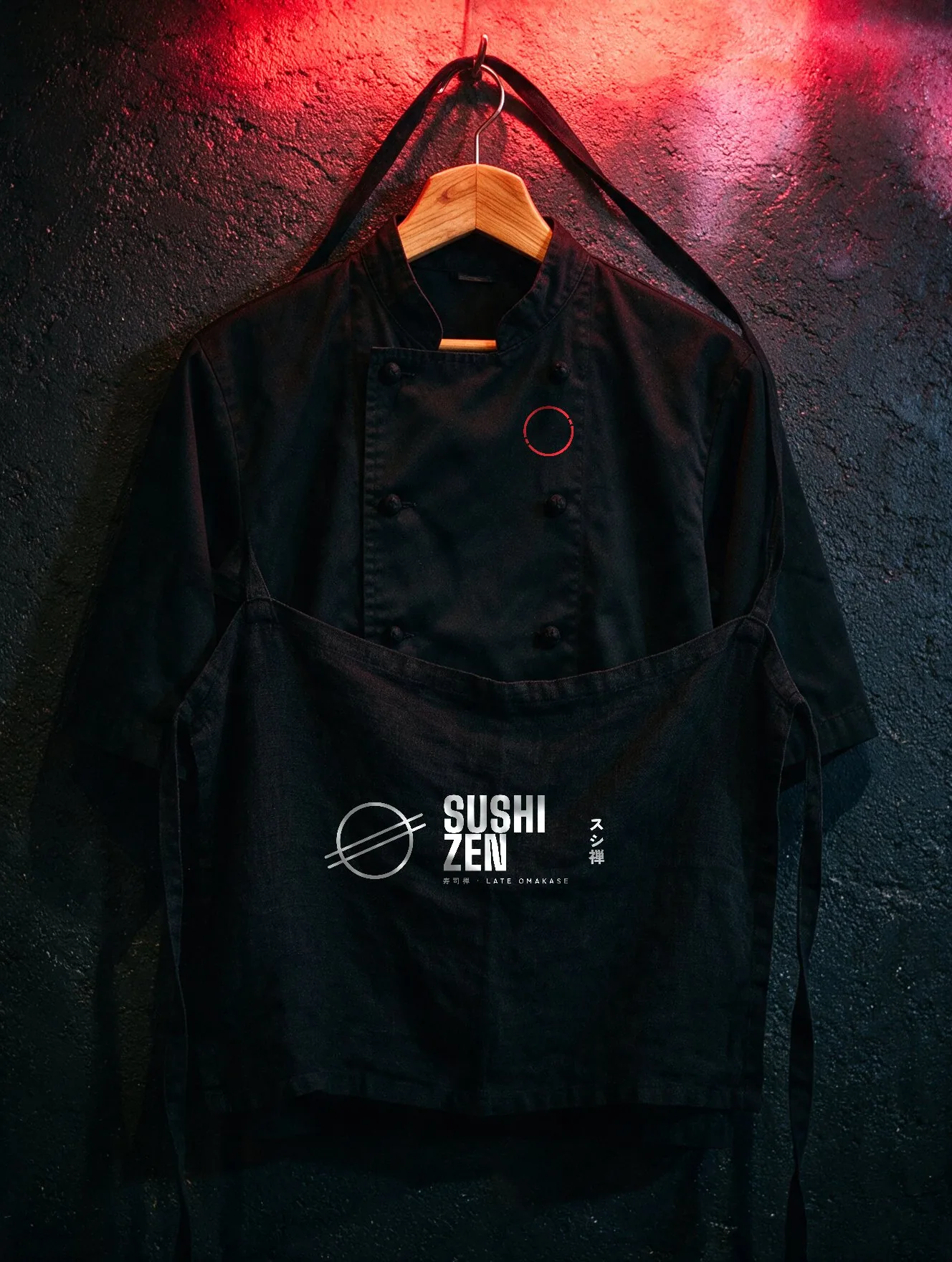
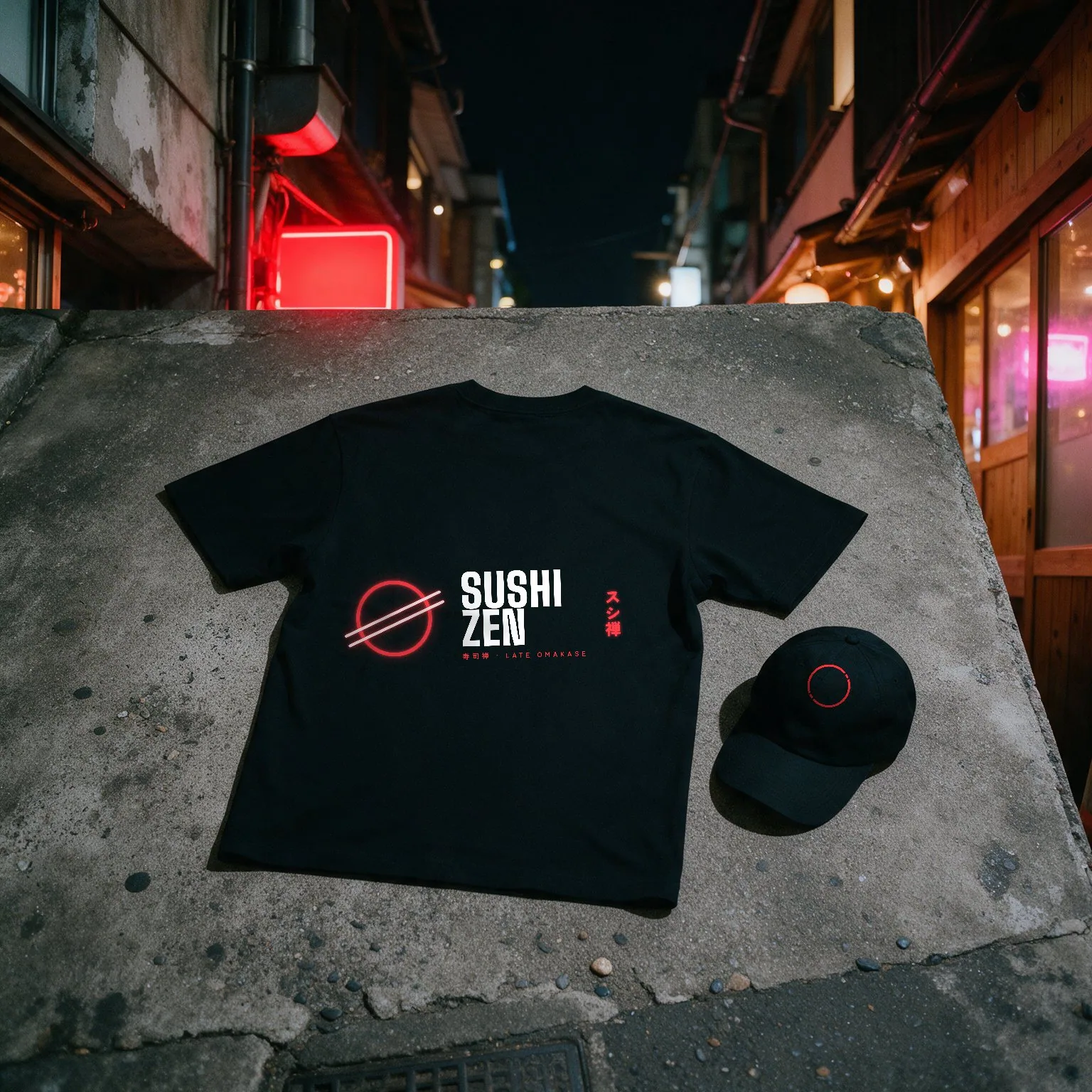
Neon only where it can glow — the sign, the fascia, a tee. Everywhere else the same red becomes shu ink on kraft, washi and ceramic.
Social, after hours.
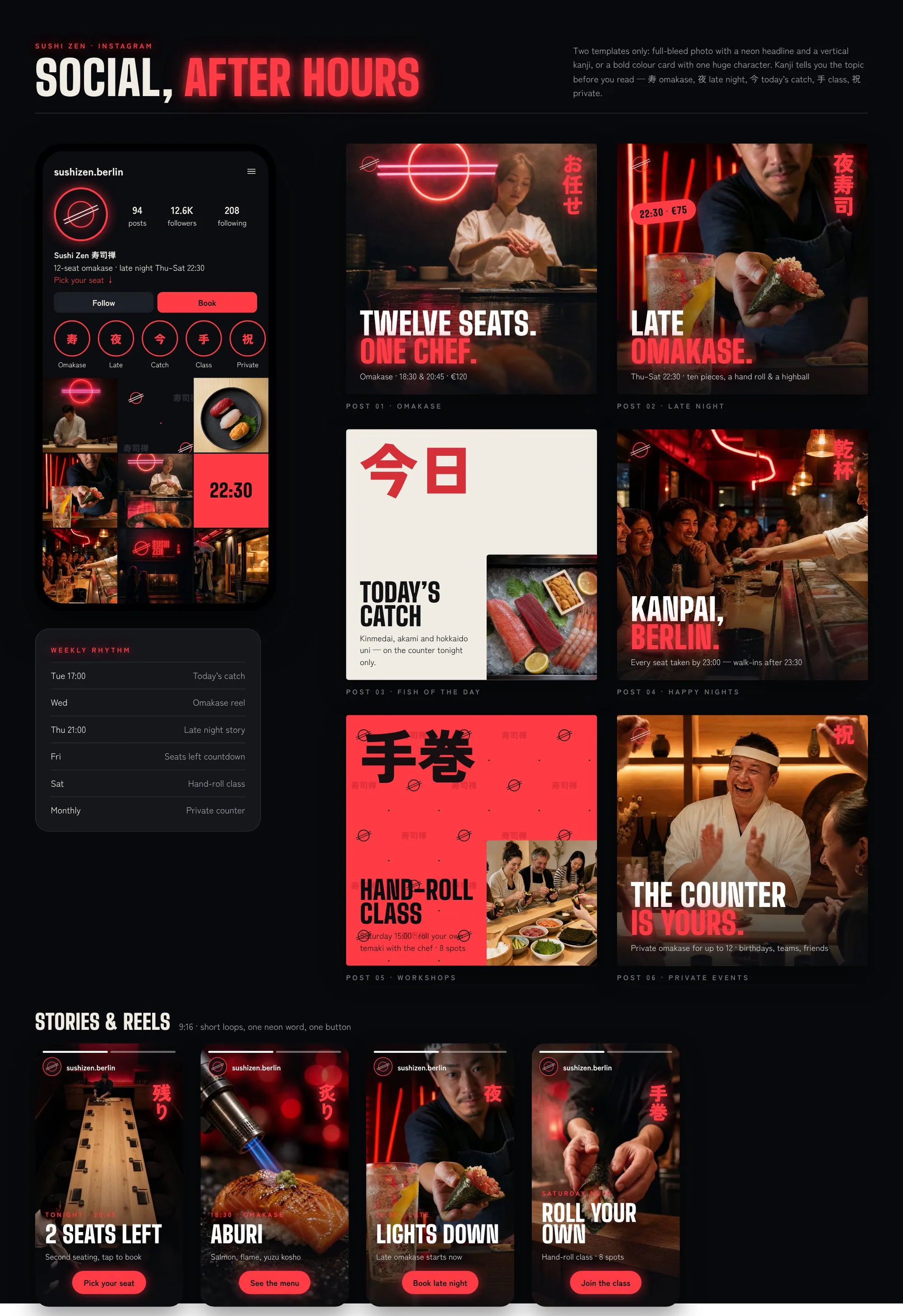
Two templates only: a full-bleed photo with a neon headline, or a bold colour card with one huge kanji — 寿 omakase, 夜 late night, 今 today’s catch, 手 class, 祝 private.
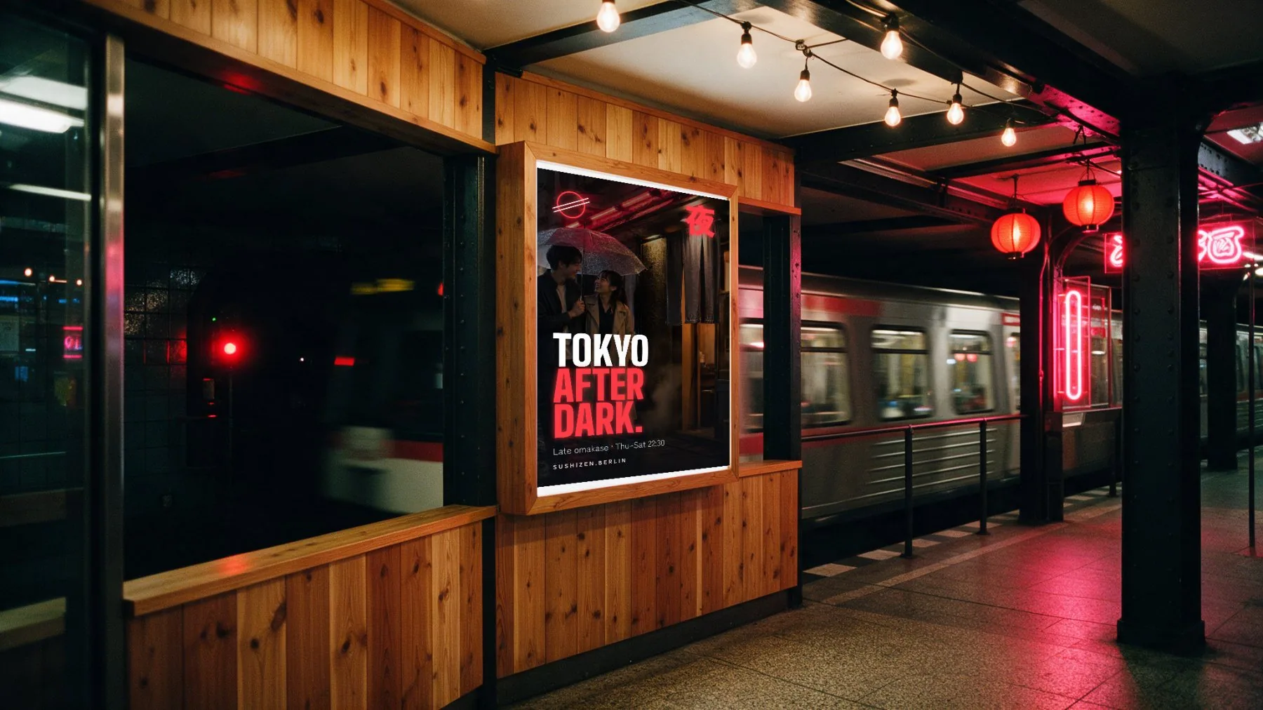
Glow on the street.
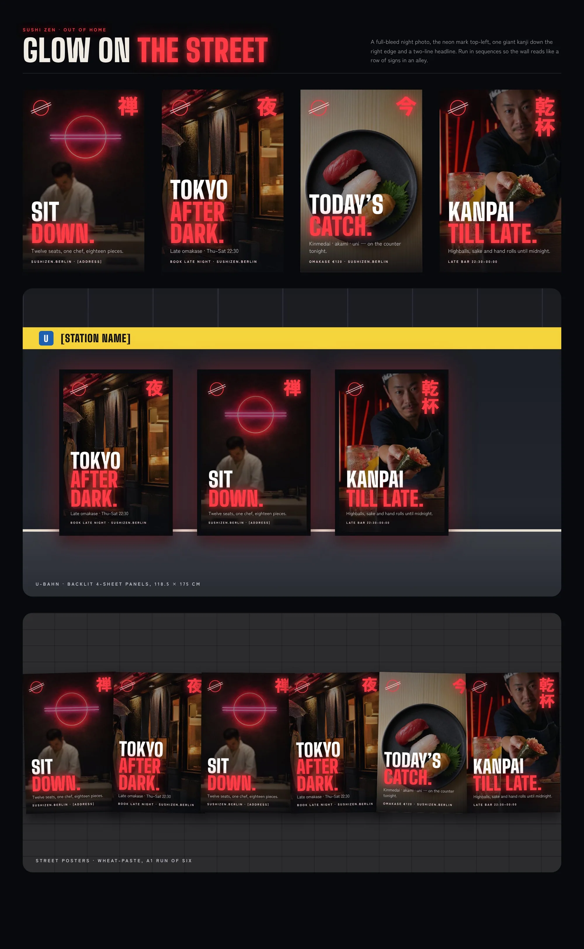
Backlit U-Bahn panels and a wheat-paste run of six. Posters hang in sequence, so the wall reads like a row of signs in a Tokyo alley.
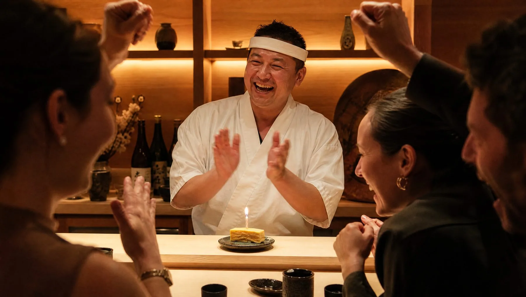
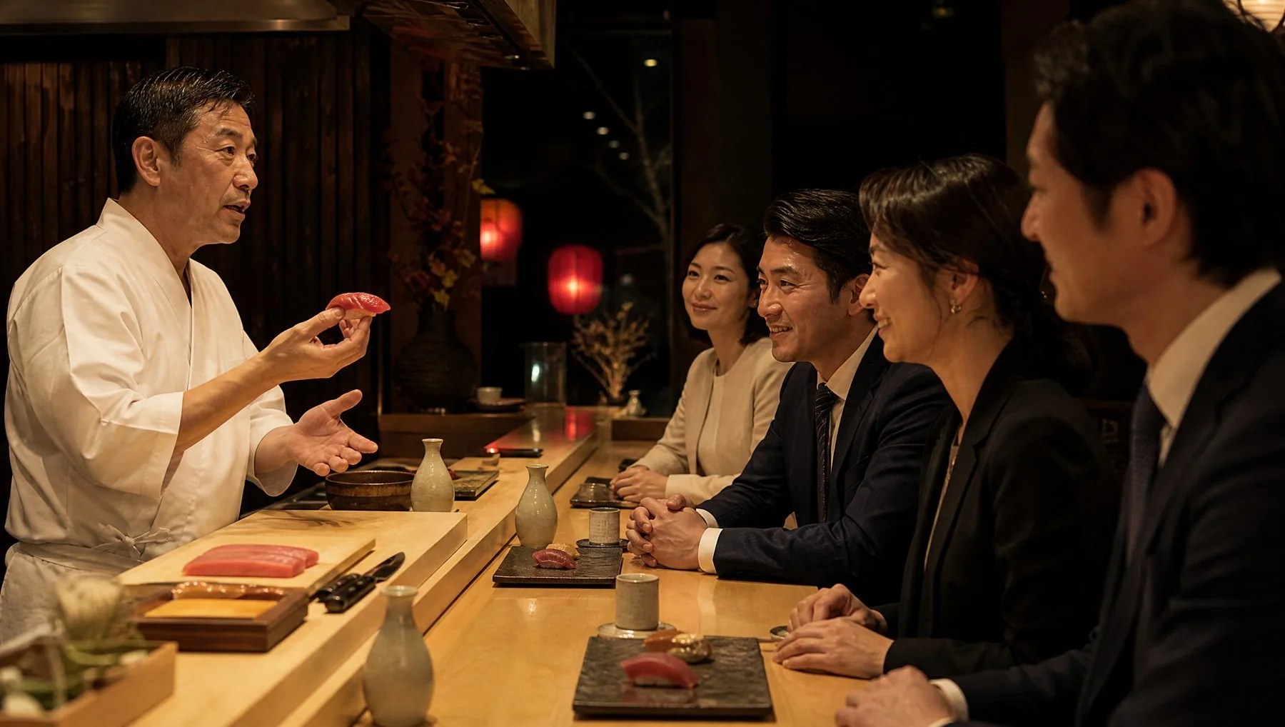
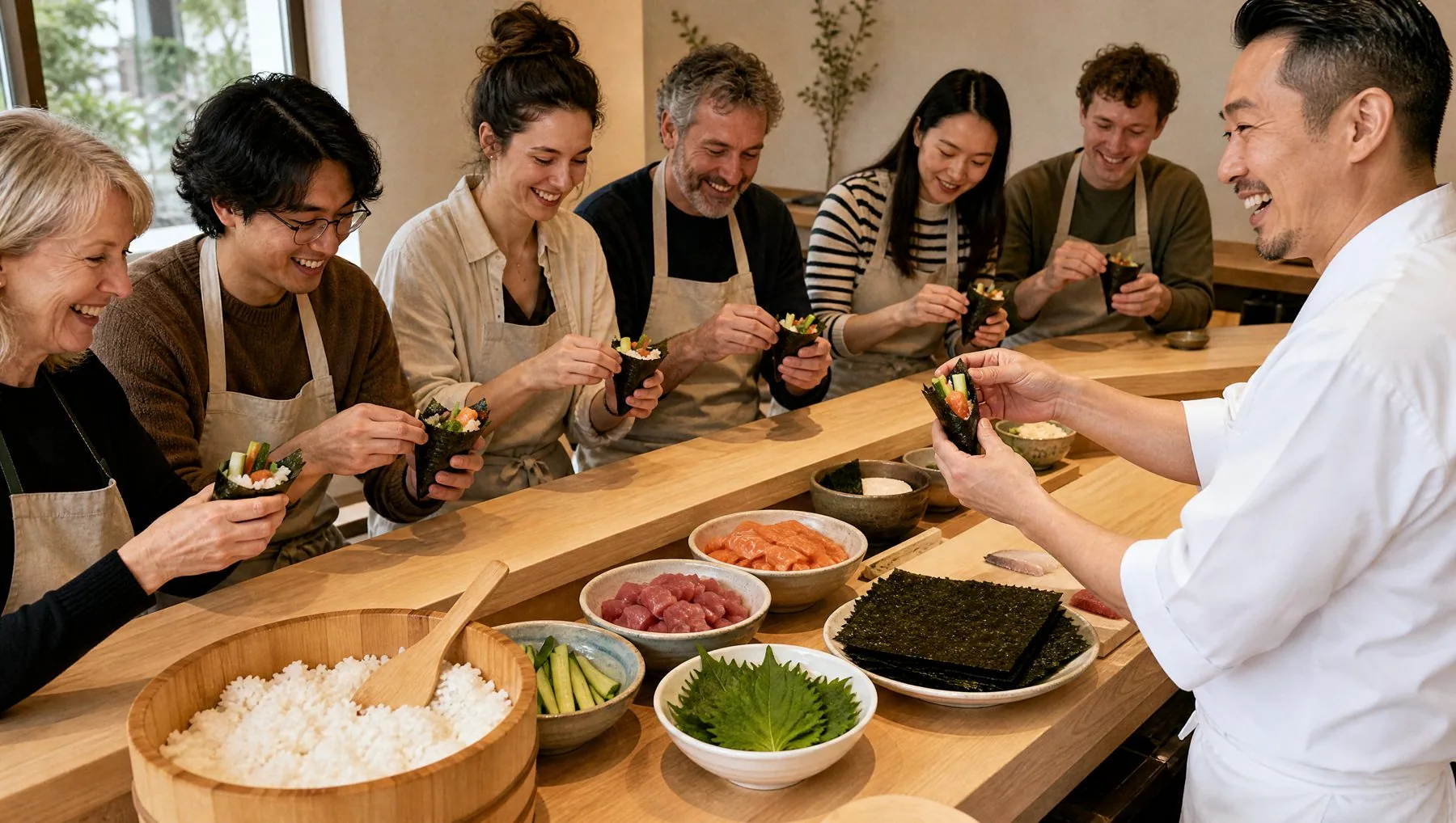
Take the whole counter.
Birthdays with a candle on the tamago, team omakase with a chef’s talk, and Saturday hand-roll classes.
Kanpai, Berlin.
Contact
Have a project in mind?
Tell me a little about the project and I'll get back to you within one working day to set up a short intro call.