
Community sport app · Herzliya
Go&Play turns the city into a gym.
Join a class or a game near home, with a coach or with friends. Book it, chat with the group, show up, rate it. A refreshed brand, a 15-screen app and a launch campaign for a sport app built around one feeling: moving together.
- Year
- 2026 refresh
- Role
- Branding, UX/UI, art direction
- Deliverables
- Logo, app icon, 15-screen app, social, paid ads
- Tools
- [Figma, Illustrator, Photoshop]
The problem
Five group chats. One app.
Working out with coaches meant a WhatsApp group for every trainer — four or five of them, each with its own times, places and payment requests. Messages got lost, spots were unclear and finding something new nearby took asking around.
FindMap and filters for sport, level, price and time.
BookLive spots left and pay in the app.
TalkOne group chat per event, not per coach.
CreateNo game nearby? Start one and let people join.

Moving is easier together.
One stroke, one head.
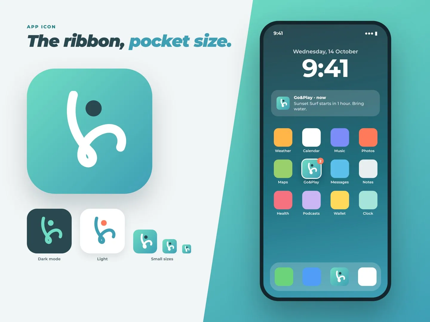
The refreshed mark is a single ribbon: an arm, a body and a leg mid-jump, with a round head above. One stroke width everywhere and round caps, so it holds up from a billboard down to a 16 px tab icon.
Go&Play
Montserrat Black Italic, tracked tight. The mint ampersand is the only colour in the wordmark — it is literally the “together”.

The original figure kept its energy; the refresh joins it into one continuous line, adds the head as a separate dot for clarity at small sizes, and swaps the generic sans for an italic that leans forward.
04 · Colour versions
Primary · on navy
Go&Play
On the slant gradient
Go&Play
On white
Go&Play
One colour
Go&Play
✕ Don’t break the ribbon into pieces
✕ Don’t change the stroke width
✕ Don’t set the wordmark upright
✕ Don’t put coral on the wordmark
Everything leans forward.
Headers and cards are cut on a diagonal — “the slant”, carried over from the original app. Mint means go, coral means hurry: last spots and live moments.
Navy#2A4850
Text, wordmark
Text, wordmark
Teal#3E9FB5
Gradient end
Gradient end
Mint#6FDCC3
Mark, actions
Mark, actions
Ice#D7F6EE
Chips, fills
Chips, fills
Coral#FF7A59
Last spots
Last spots
Cloud#F2F5F5
Background
Background
Headlines
Aa
Montserrat Black Italic
Fast, tilted, sporty — every headline is in motion
UI & body
Aa
Montserrat Regular to Bold
One family keeps the app calm under the italics
The slant
Cut on a diagonal.

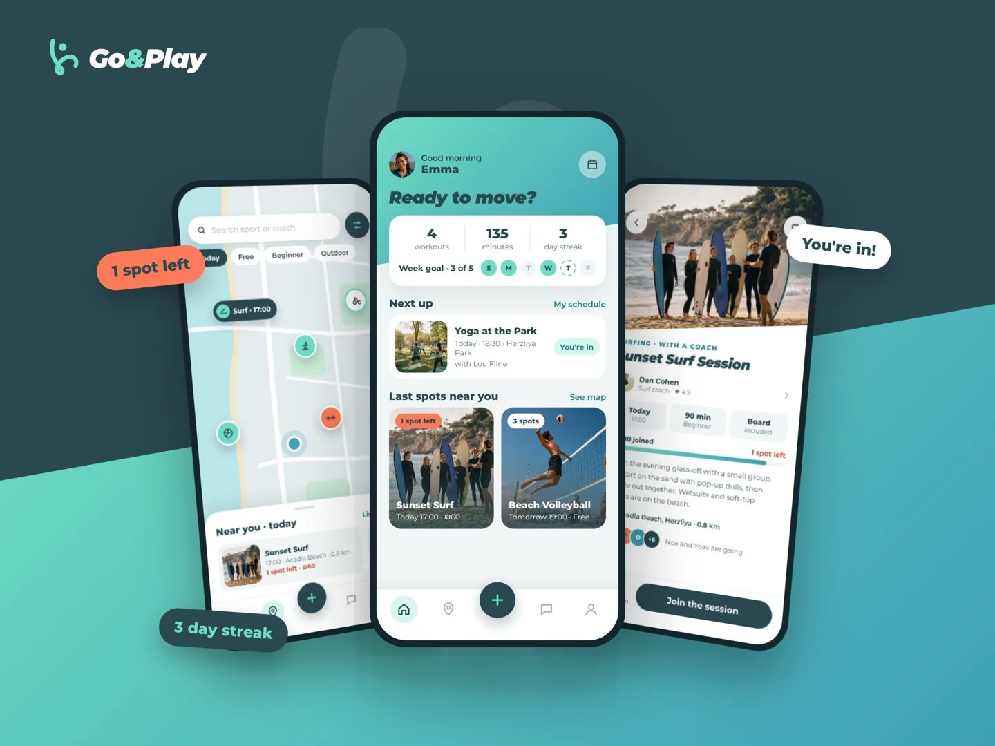
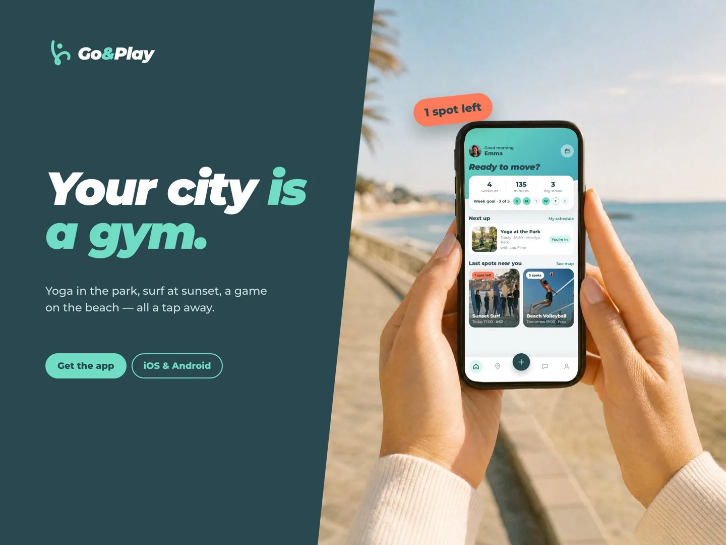
From couch to court in four taps.
Bright, airy screens with one slanted header each. Live “spots left” counters turn coral as an event fills, and the weekly goal keeps people coming back.
01 · DiscoverPick favourite sports once, then browse a map of what’s on near you today.
02 · BookEvent page with coach, level and spots — free games join in a tap, lessons pay in-app.
03 · ChatEvery booking opens its own group chat with the coach and players.
04 · Play & rateRate the session, build a streak, or create your own game for others to join.
Key screens.
A feed that moves.
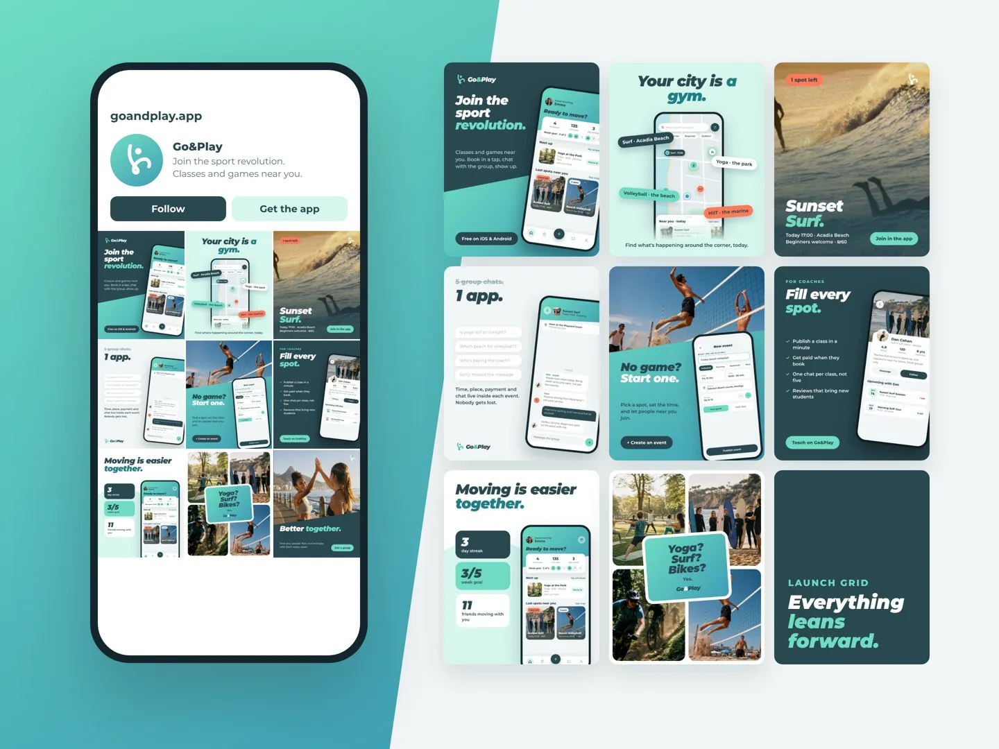
The launch grid alternates navy, mint and photo tiles, each one cut by the slant. Every post sells one feature — the map, last spots, group chat, creating a game, coaches, streaks.
Posts that get you out.
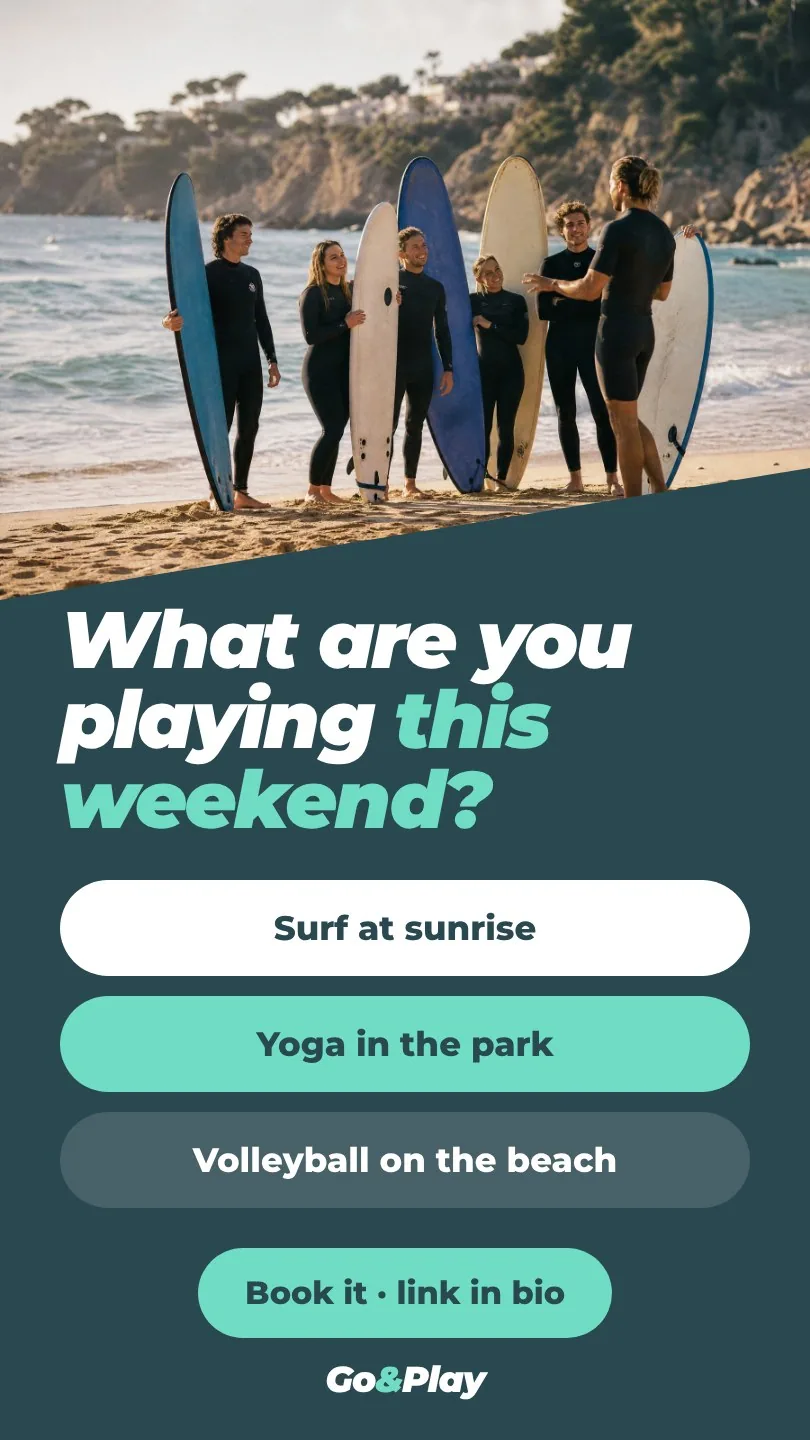
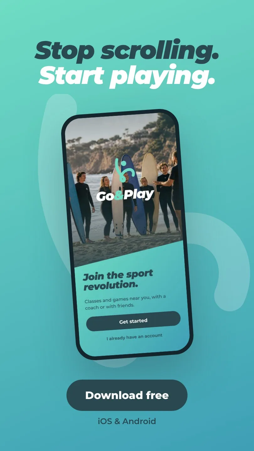
Stories
Polls to start the conversation, a swipe-up to start playing.
Paid social, install first.
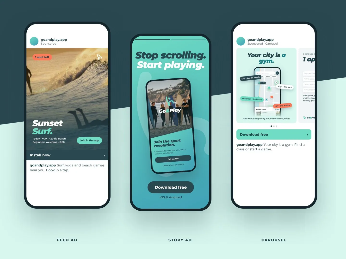
See you on the court.
Contact
Have a project in mind?
Tell me a little about the project and I'll get back to you within one working day to set up a short intro call.